
Context
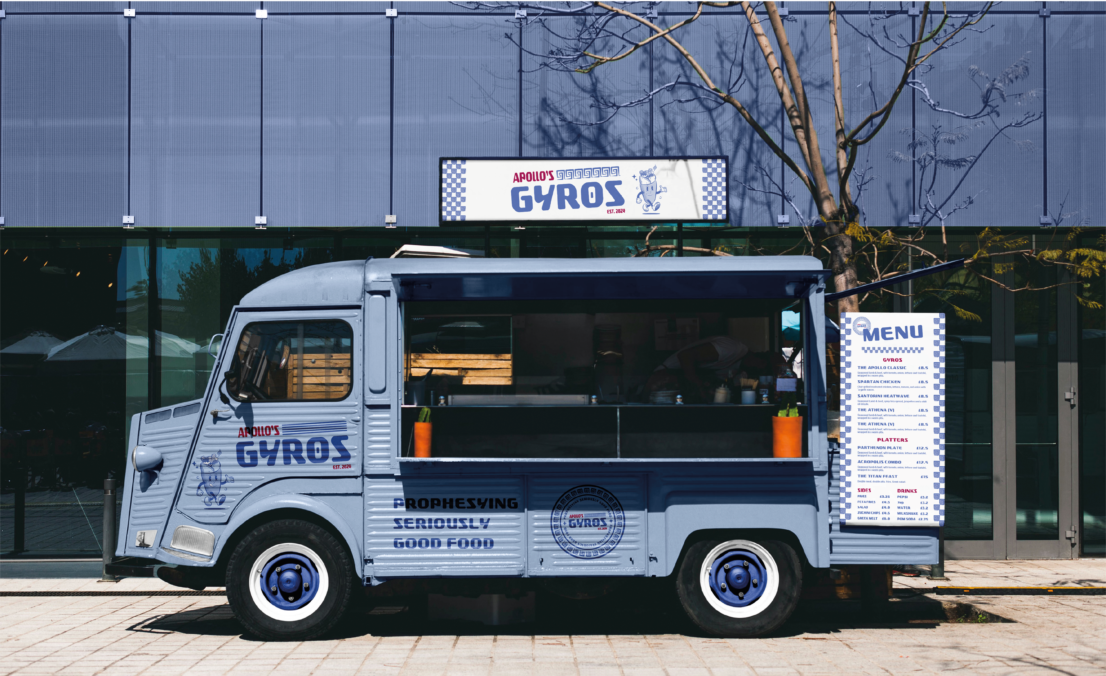
Apollo’s Gyros is a street food truck chain that serves Greek cuisine. With this concept, I was inspired by Retro pizzeria designs of the 1960s. I also wanted to create a restaurant mascot that would reference the rubber-hose style.
Industry
Hospitality, Food and Drink
Role
Graphic Designer
Services
Brand Design
Tools
Adobe Illustrator, Photoshop
Identity
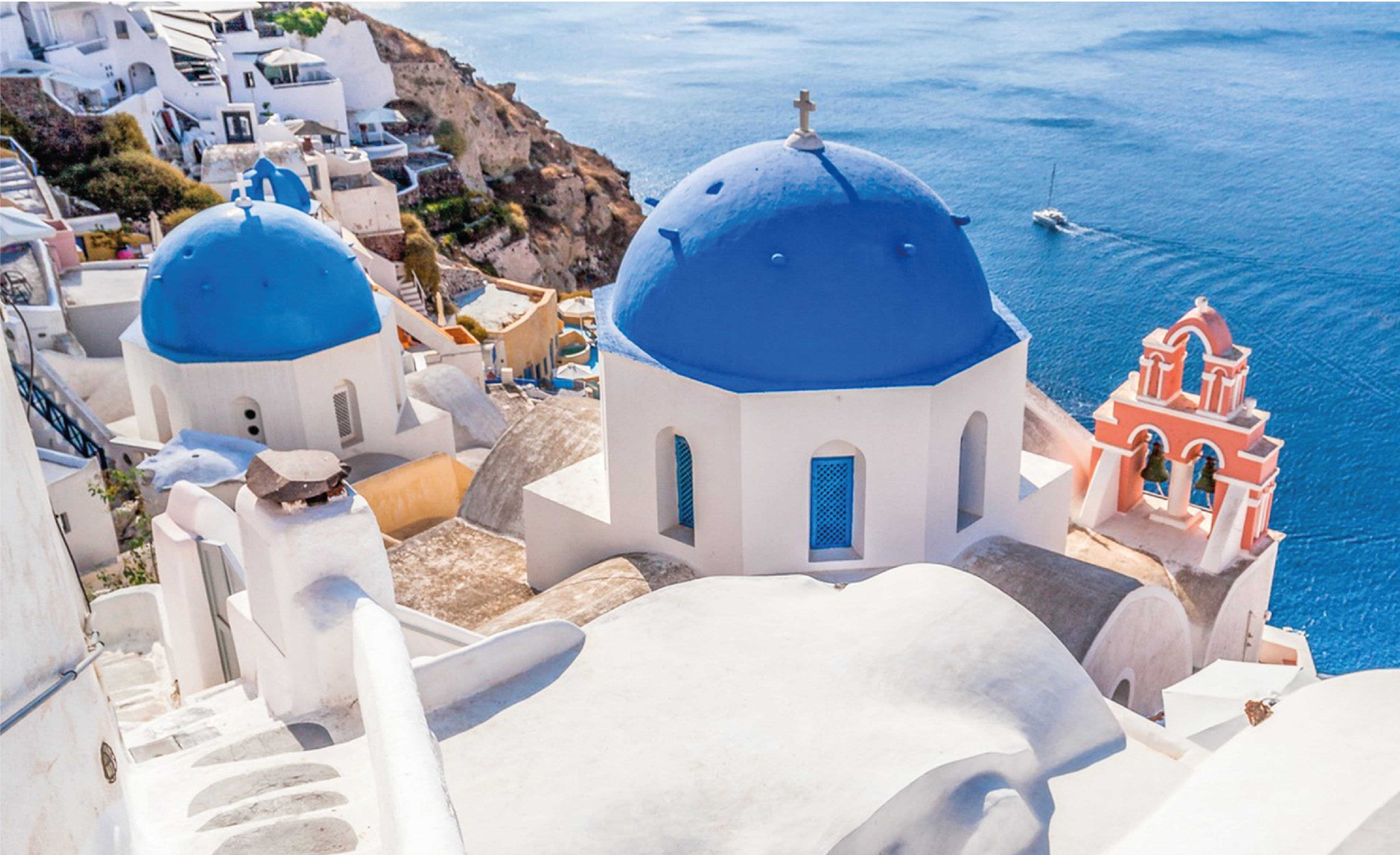
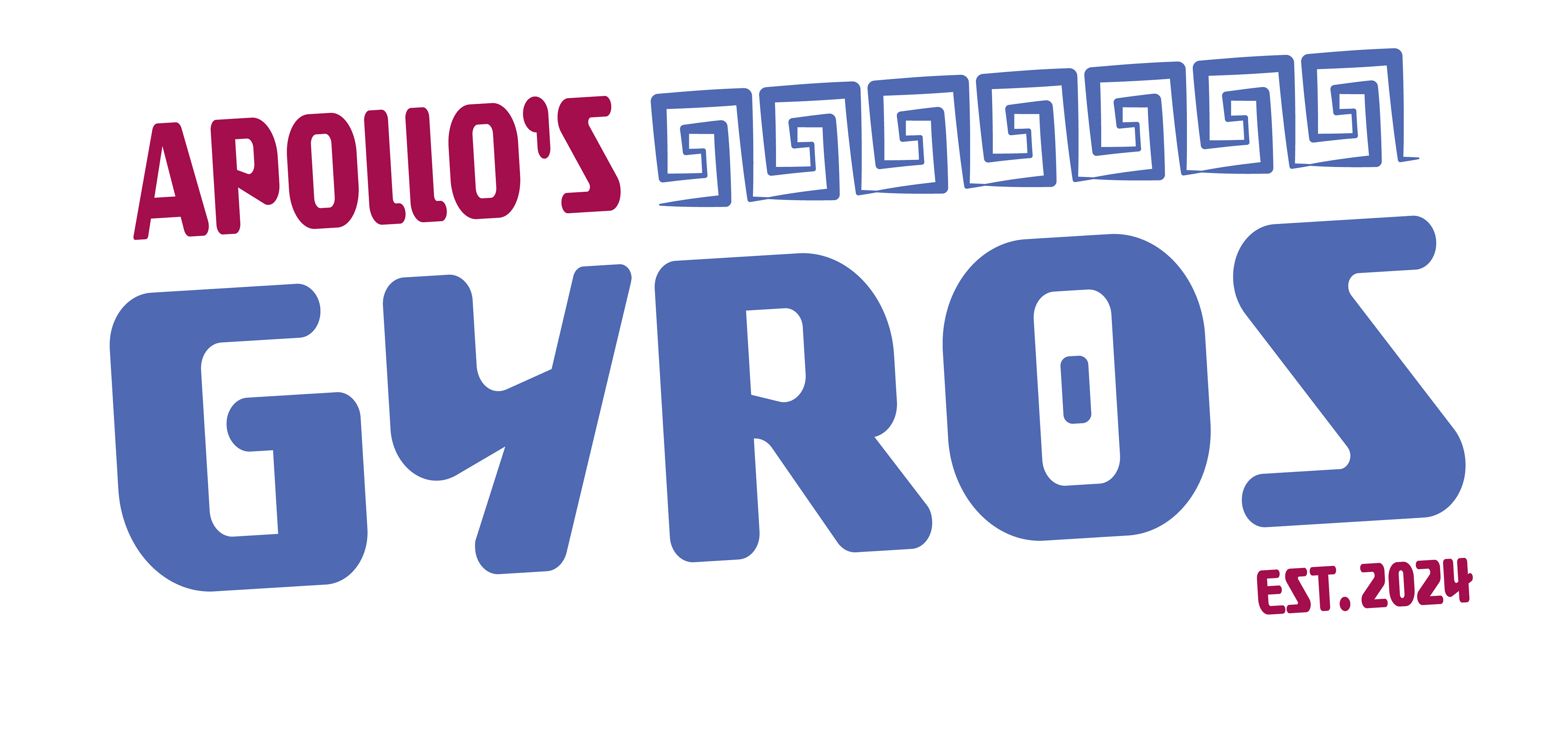
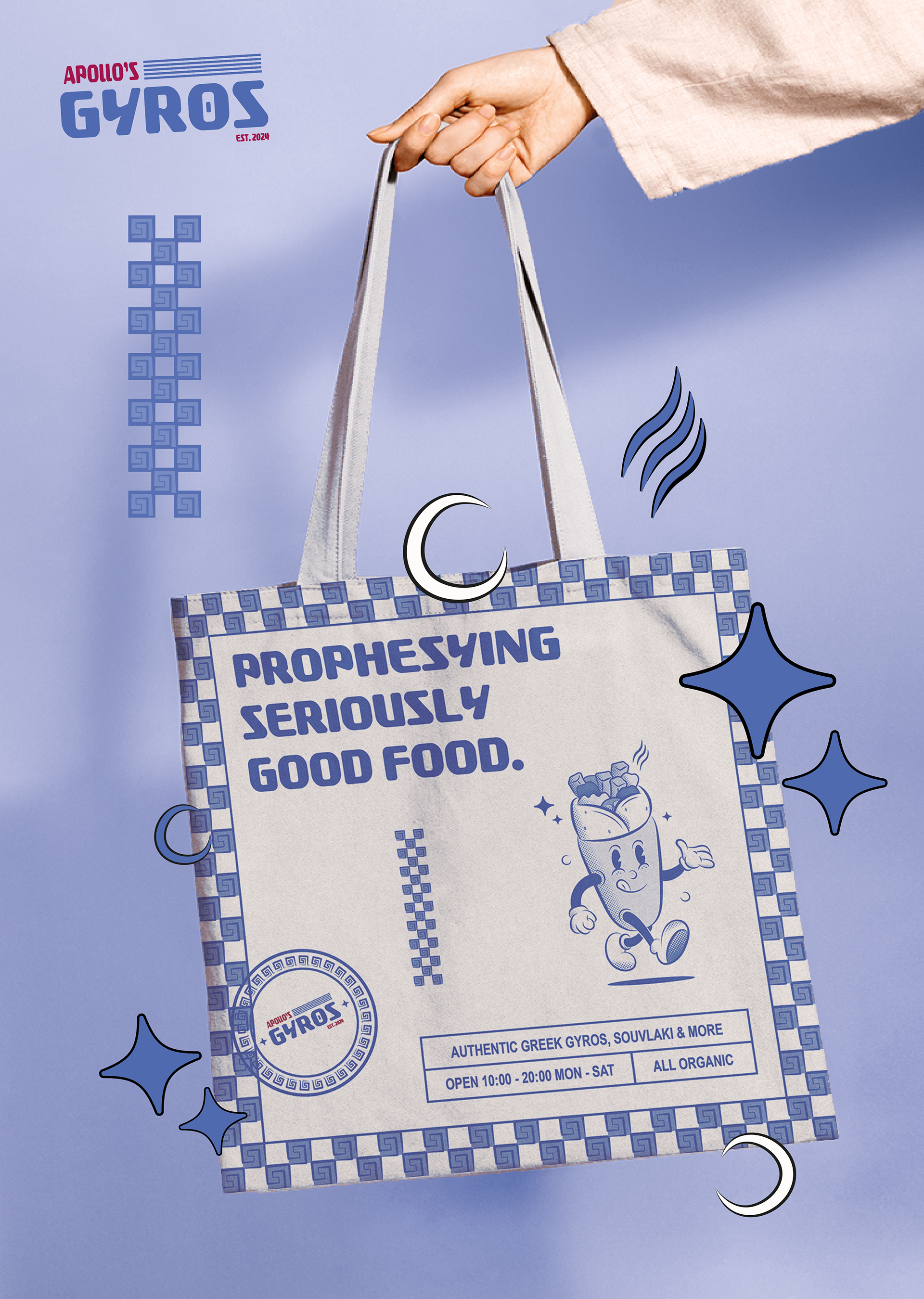
Apollo’s Gyros is all about the retro vibes, specifically those of 1960s pizzerias. The desire was to bring that flavour into one of my favourites, Greek cuisine. From the jump I wanted to incorporate a limited colour palette was that echoed Greece itself. This was done through a selection of blue shades and a “plum” accent colour.


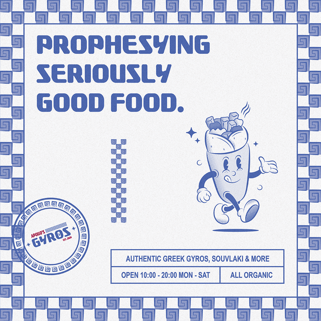
The pizzeria aesthetic continues into the Greek Key Patterns that are incorporated into a pizza box checkerboard pattern, as well as the badge logo, mimicking the stamps of authenticity that are prevalent within New York.
Greek Key Pattern Varient
The logo itself features bold, angled typography accented by a Greek key pattern, which is incorporated throughout the brand. There are two variants of the logo, one with Greek key patterning and one that utilises the five horizontal blue bands of the Greek flag.
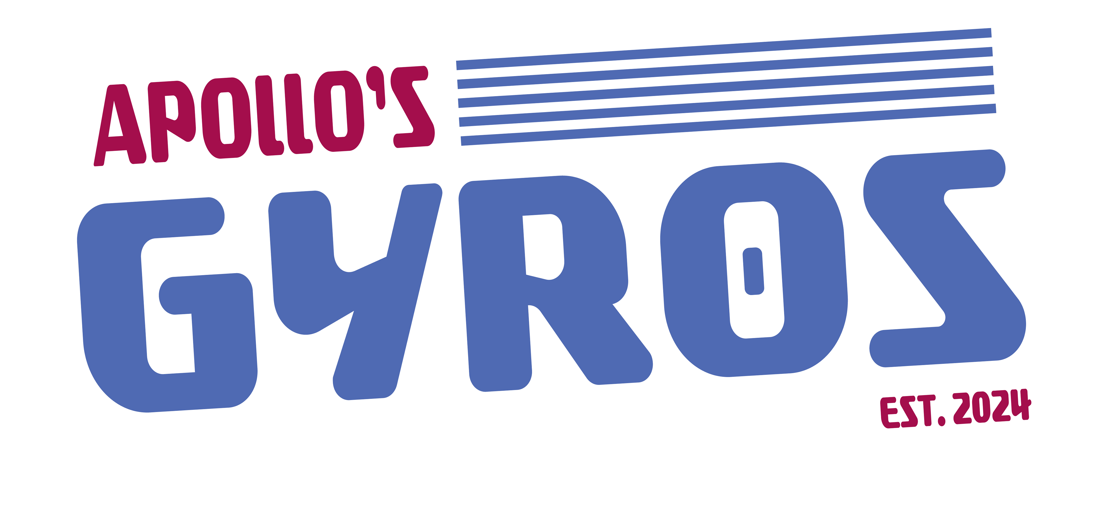
Greek Flag Varient
Character Design
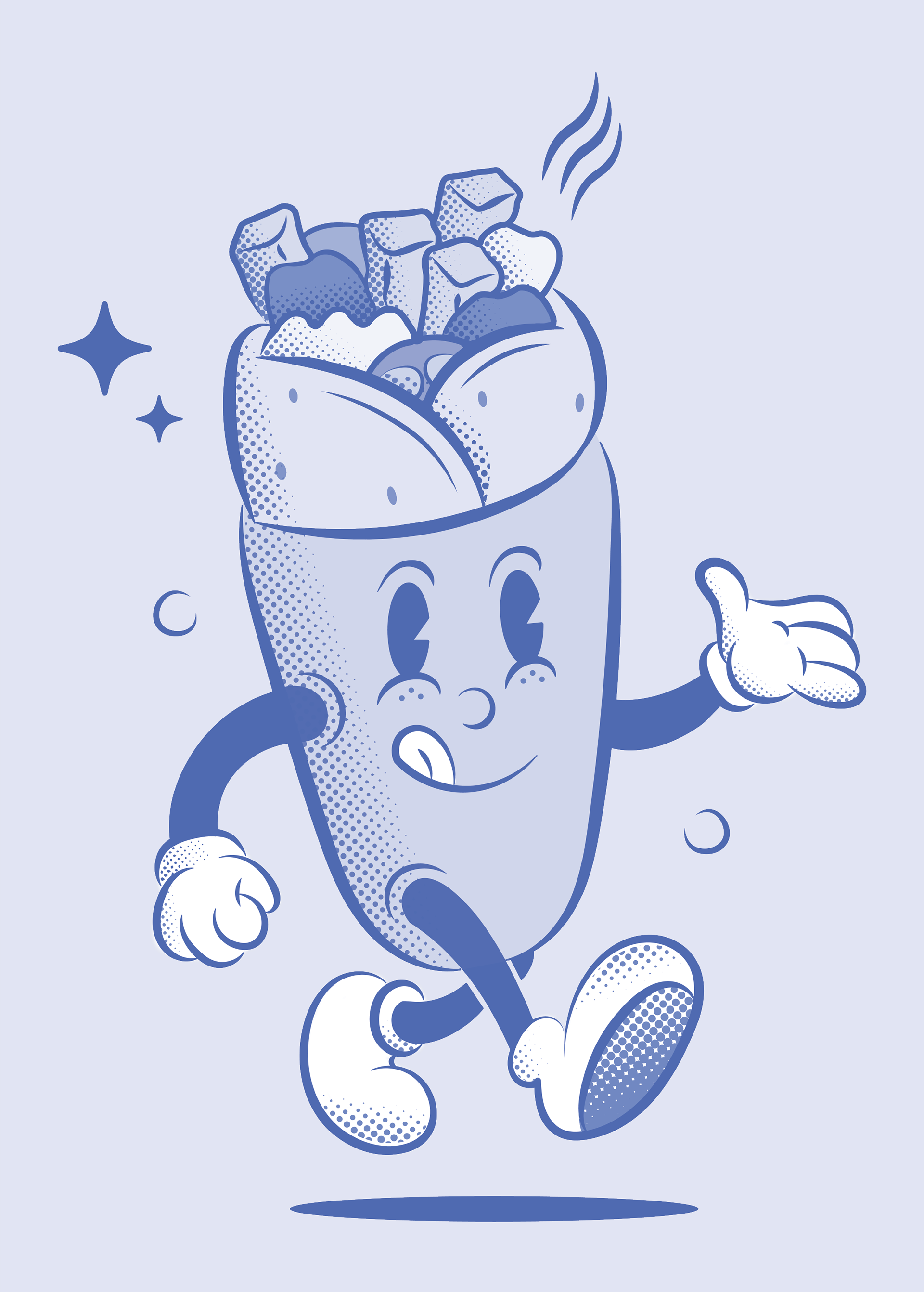
A common feature of retro pizzeria designs are the mascots.
For Apollo’s mascot inspiration was found in the recent renaissance of the 1930’s rubber hose style in contemporary design. In sticking with the name of the brand, an anthropomorphic gyro was created in the aforementioned style with halftone dots used for shading.
Application
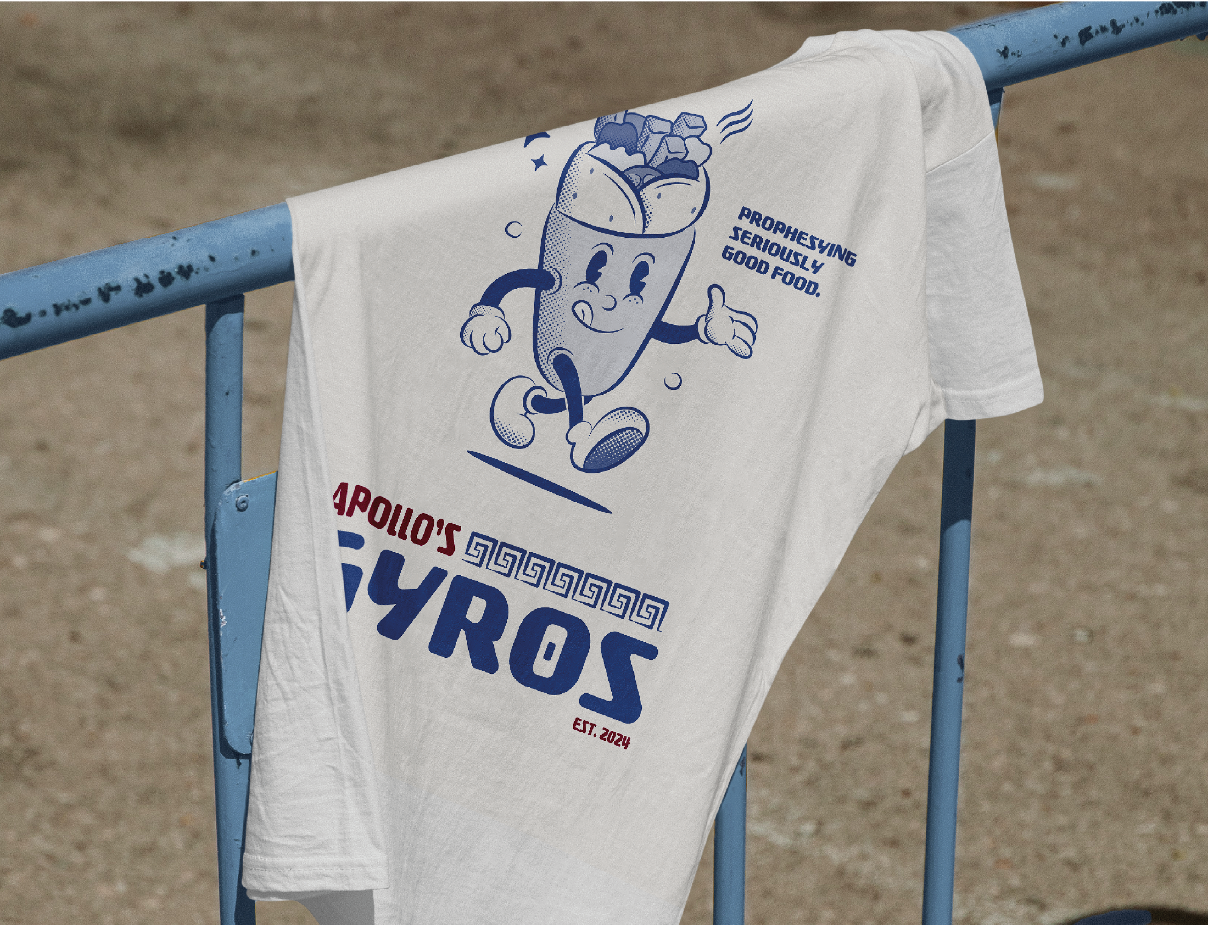
The branding of Apollo’s Gyros brings a retro standard into the modern day, with reverence to the past and Greek iconography. The use of an analogous colour palette helps ground the design, and an anthropomorphic rubber-hose mascot provides a focal point and continues the retro theme.