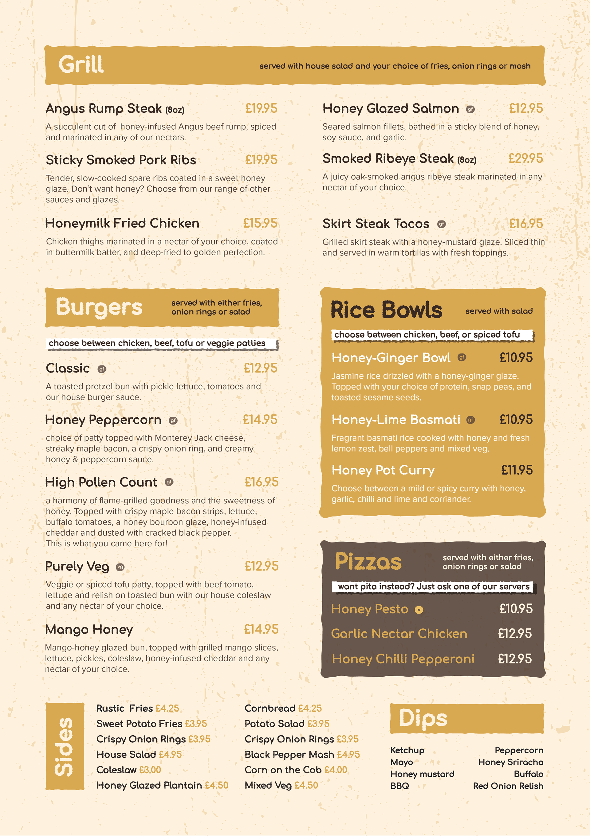
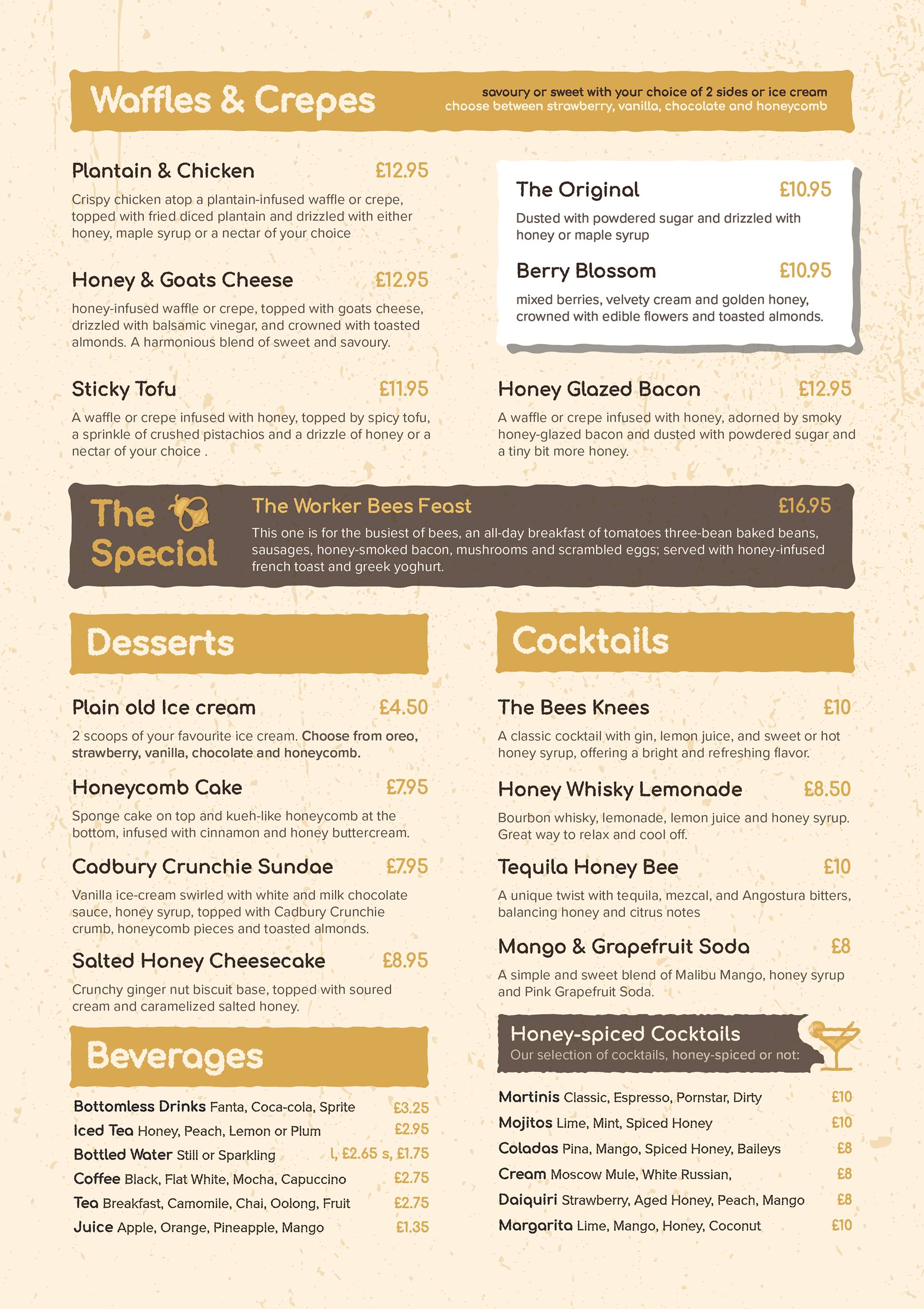
Context
bar-bee-cue is a contemporary grill & bar, specialising in honey-glazed dishes, the chain has been defined by its open kitchen concept and pool spaces. For this design I wanted to convey both maturity and playfulness that was achieved through both iconography and type.
Industry
Hospitality
Role
Graphic Designer
Services
Brand Identity, Logo Design
Tools
Adobe Illustrator, Photoshop
Identity
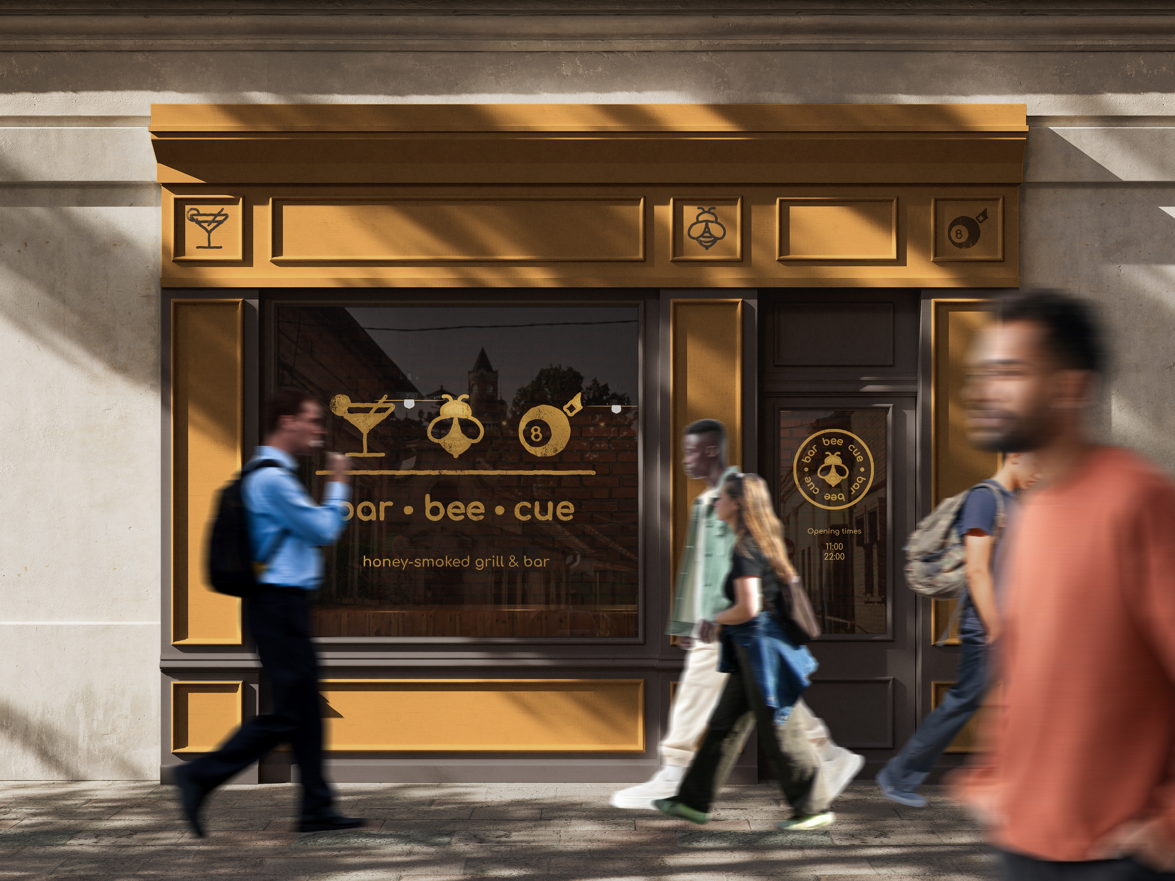
The identity for bar-bee-cue derives from an obvious play on words, which also highlights what the brand is: a honey-themed grill and bar that features games such as pool, darts and bowling.
The bar-bee-cue logo comes in many forms, a combination mark consisting of each icon and the logotype makes the primary logo and a secondary logo that takes inspiration from retro and rustic stamp logos that are synonymous with grills, steakhouses and BBQs. The badge includes the bee icon, which will be the hero icon for the whole brand.
Application
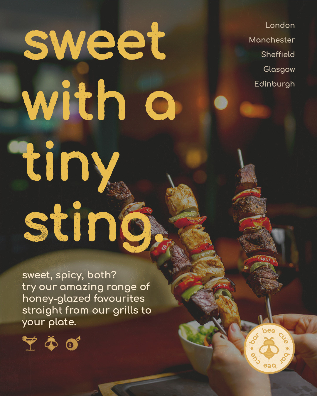
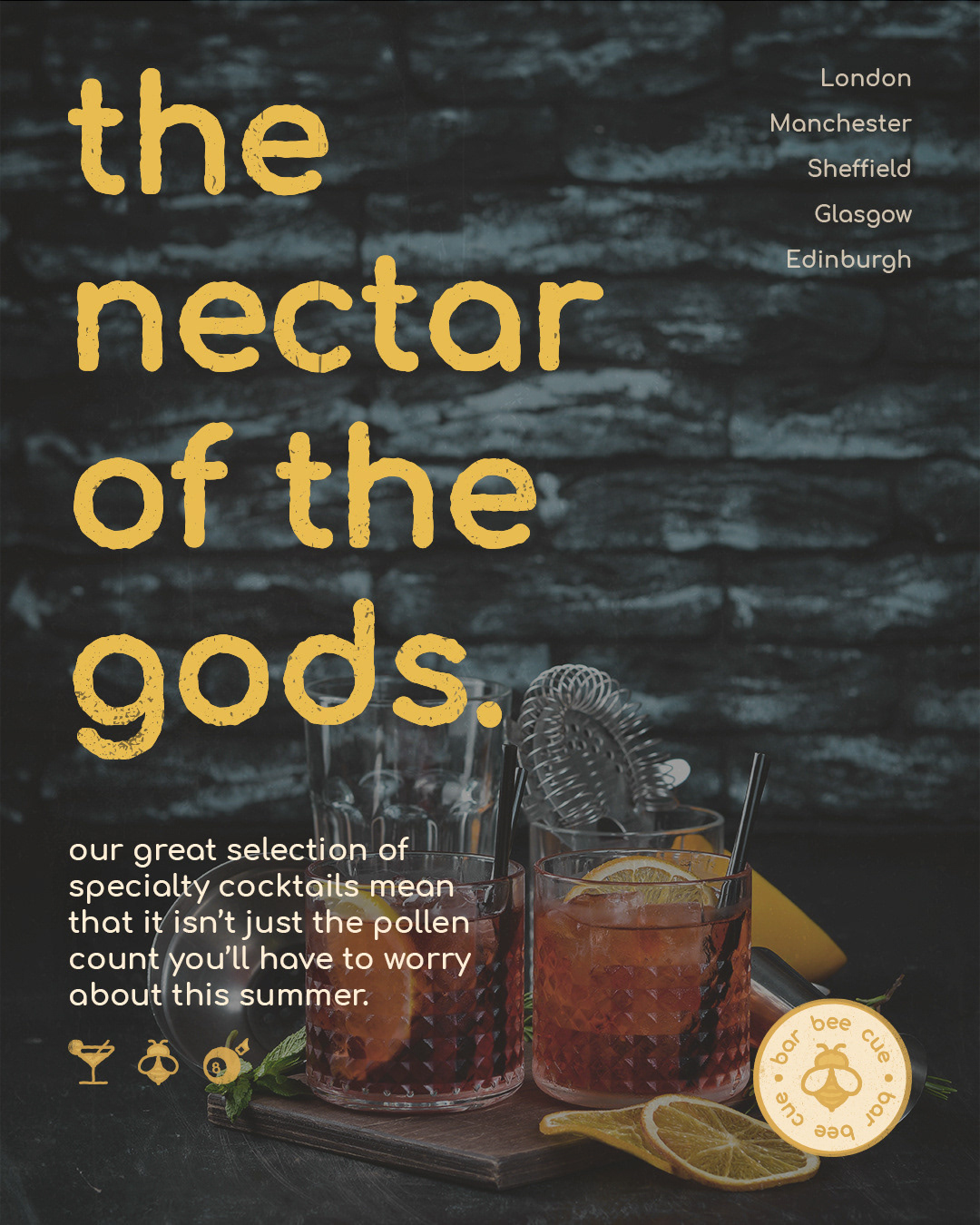
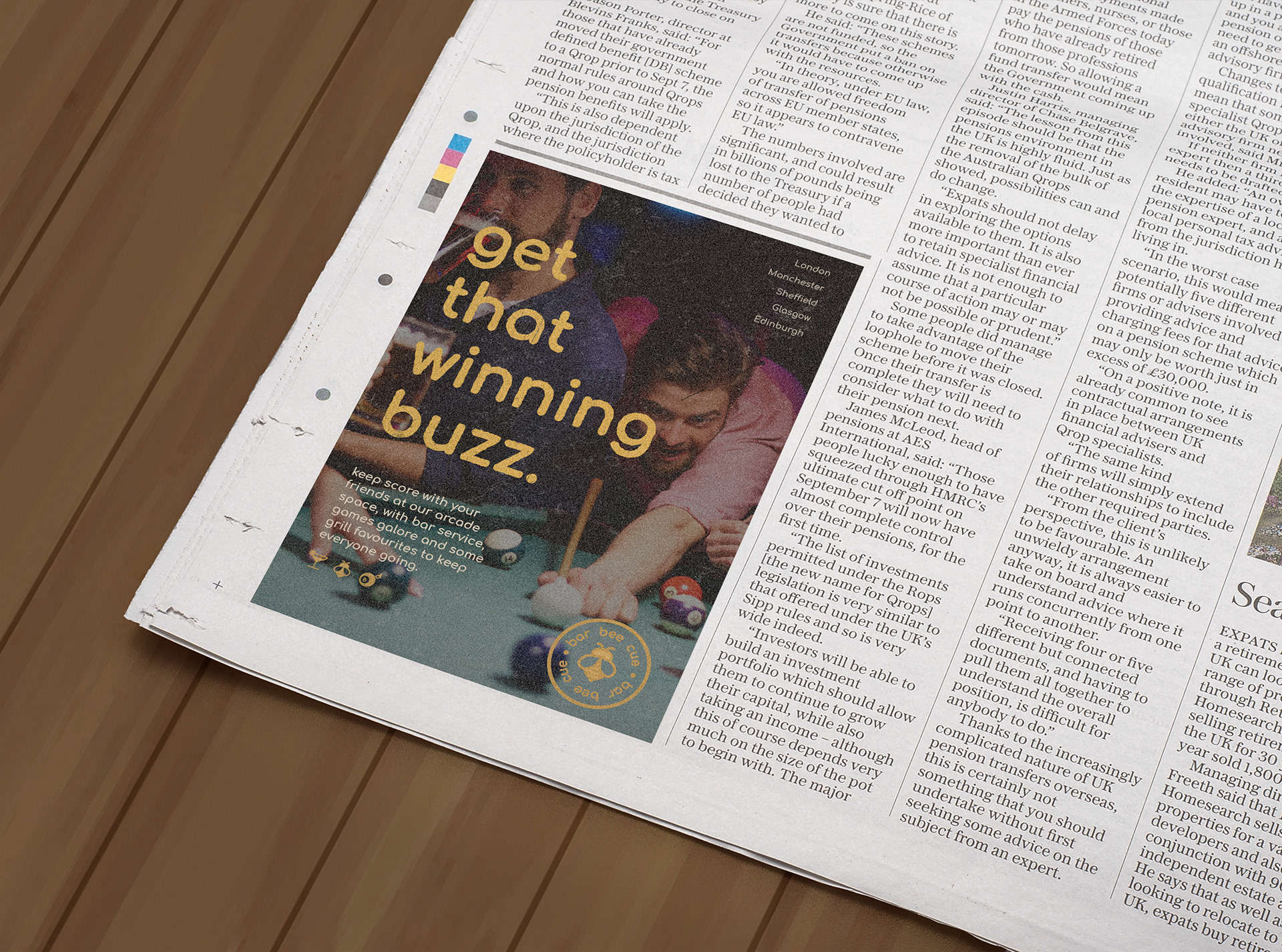
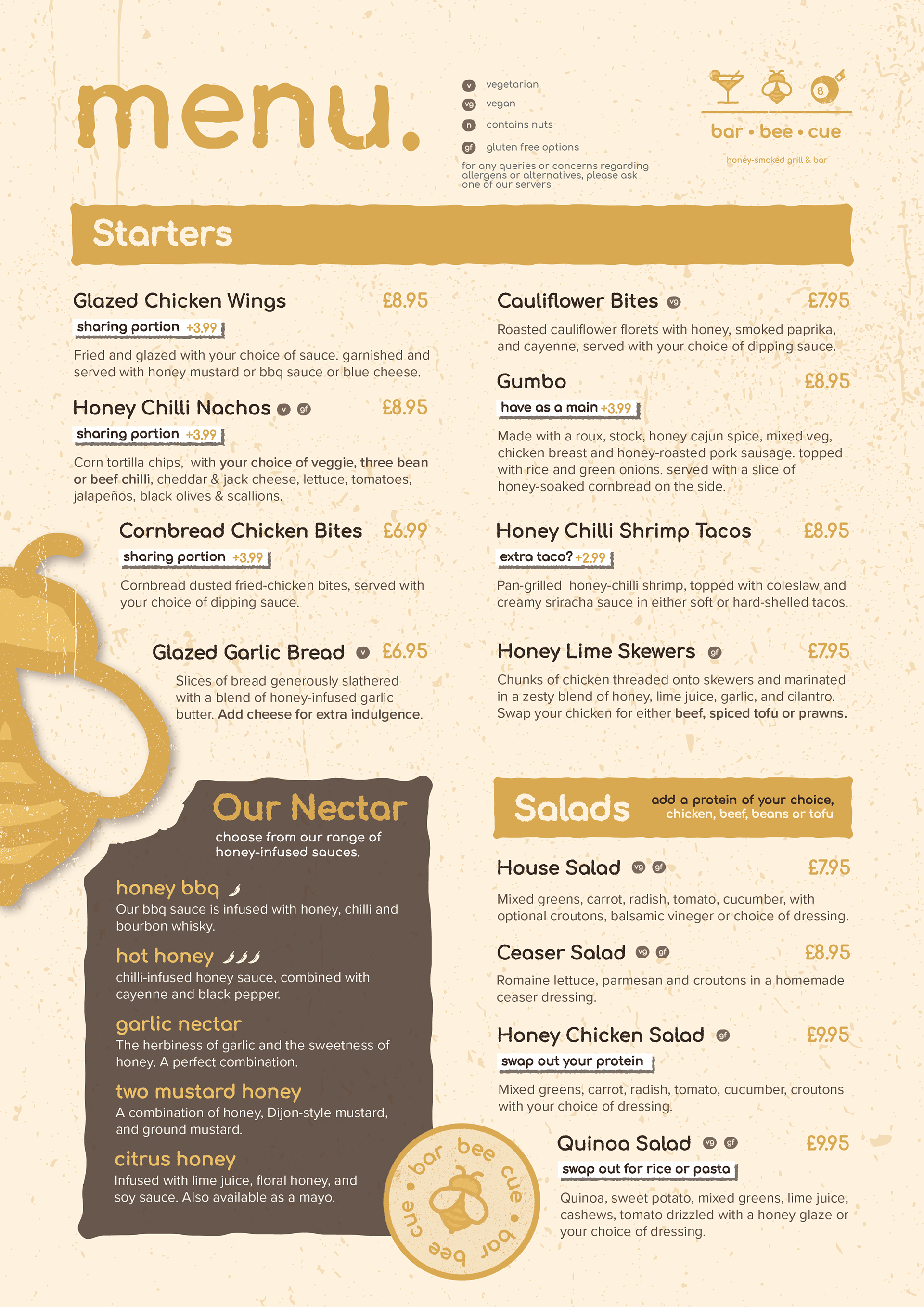
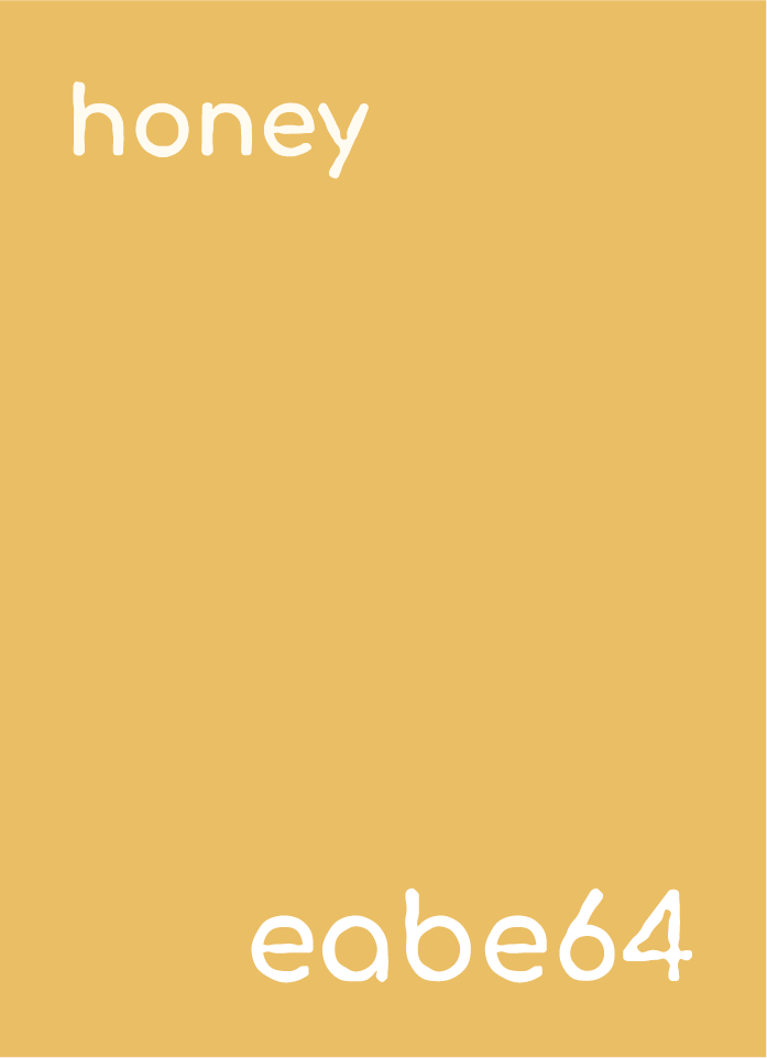
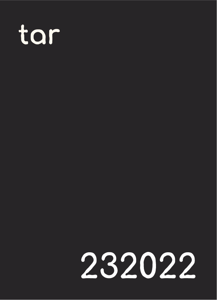
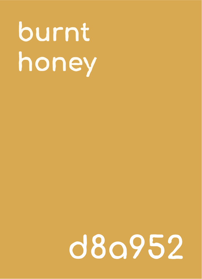
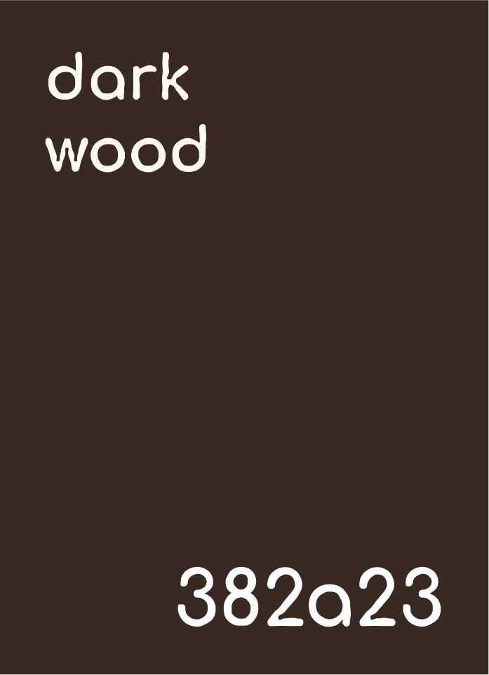
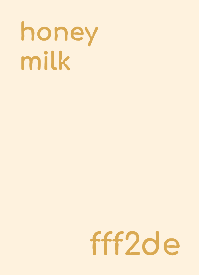
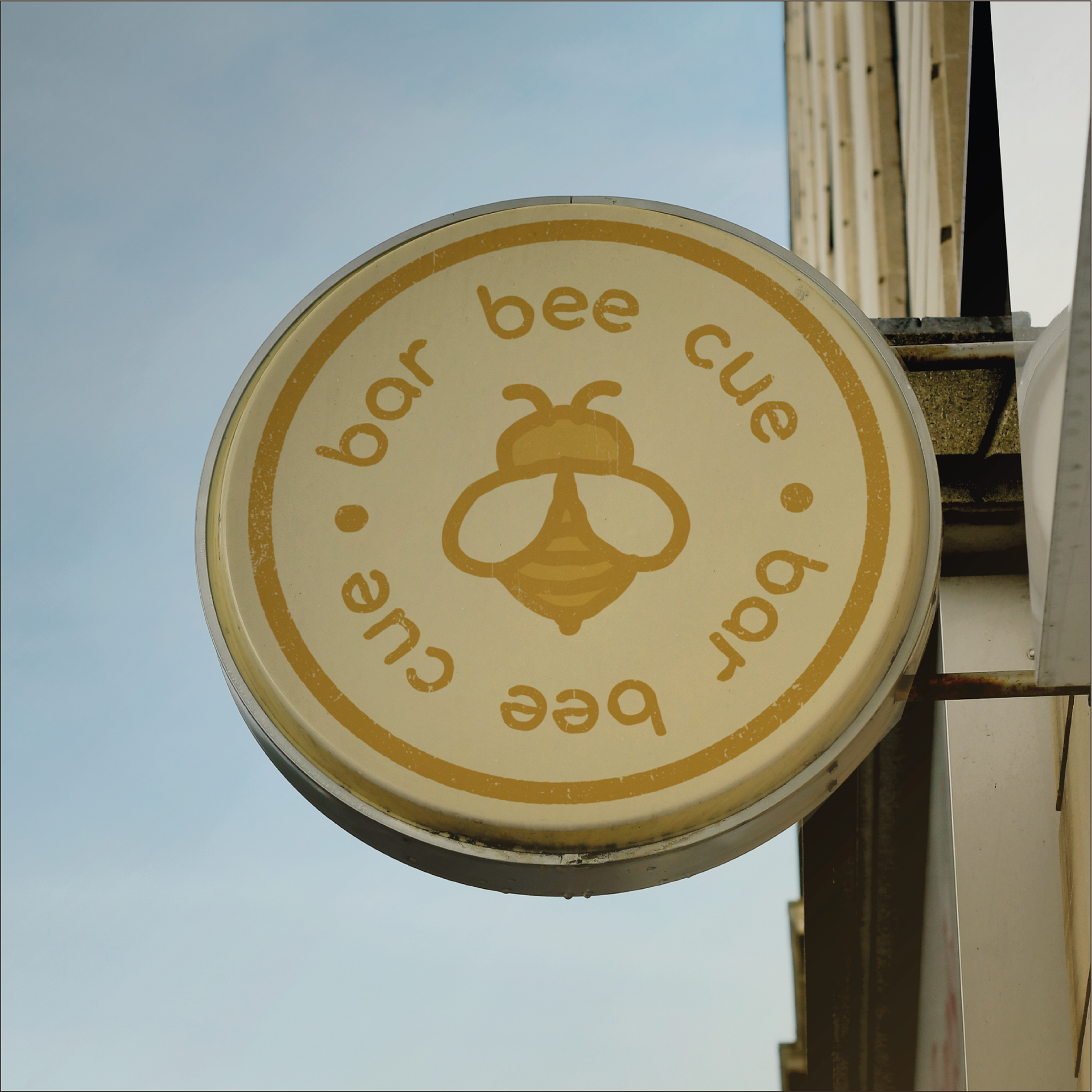
Texture and a rough edge were both important aspects of the brand identity. From the custom typeface to menus to icons, textures and scraggly edges were included to push home movement (derived from bees) and the rustic nature of the bar. Whilst the simple colour palette ensured that nothing got lost in translation.
