Context
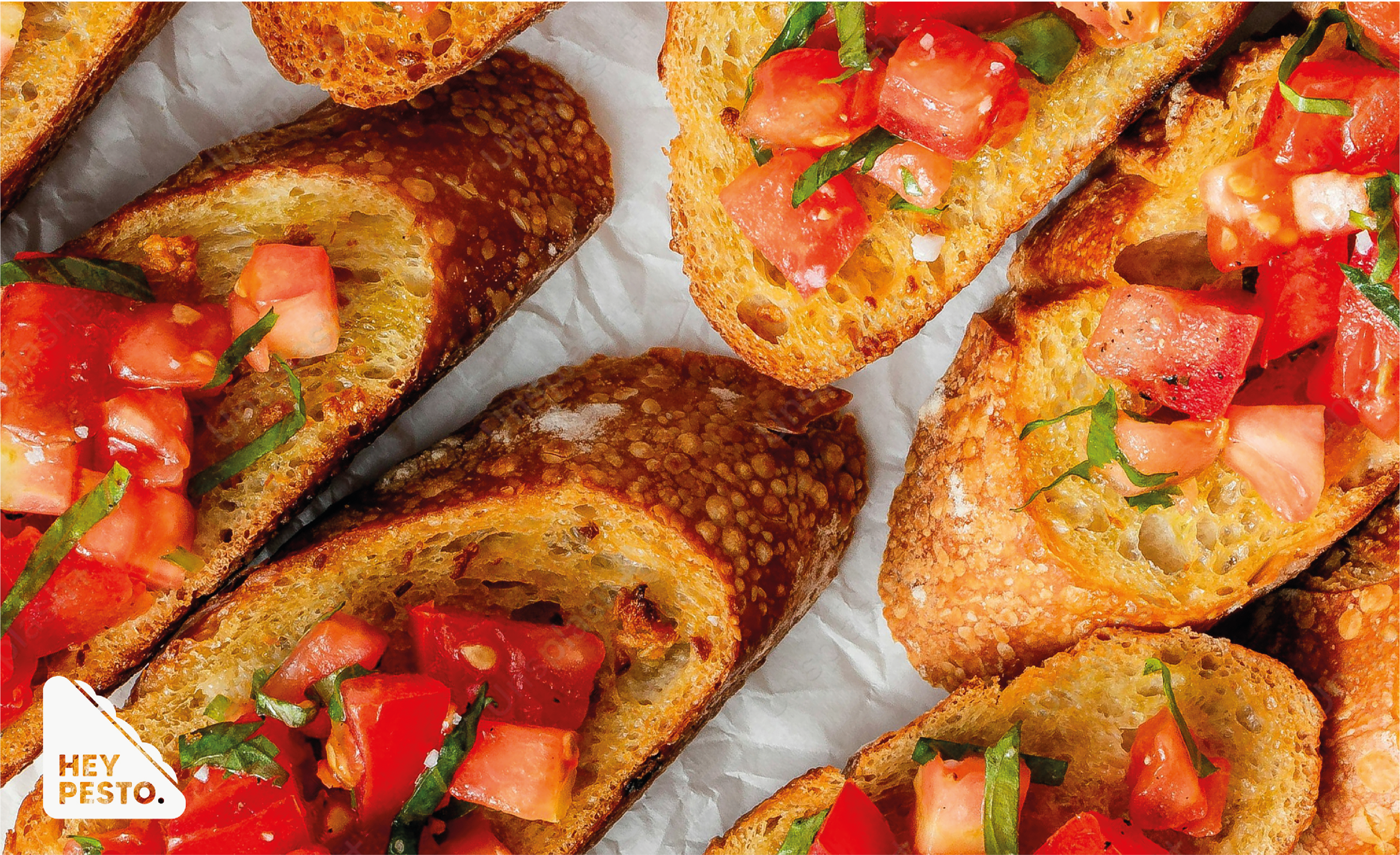
In this concept design, Hey Pesto. is an Italian sandwich and pasta chain, running several restaurants in the UK. They also supply supermarkets with chef-prepared ready meals, dried pasta, drinks and desserts.
Industry
Hospitality
Role
Brand Designer
Services
Brand Design, Logo Design
Tools
Adobe Illustrator, Photoshop
Identity
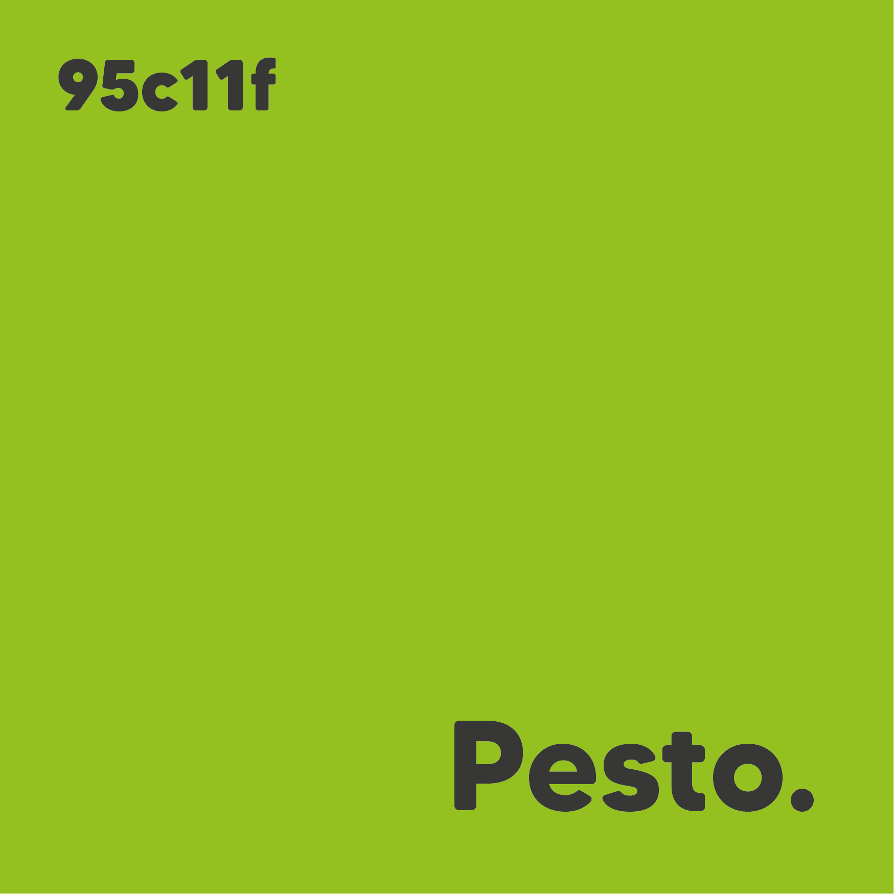
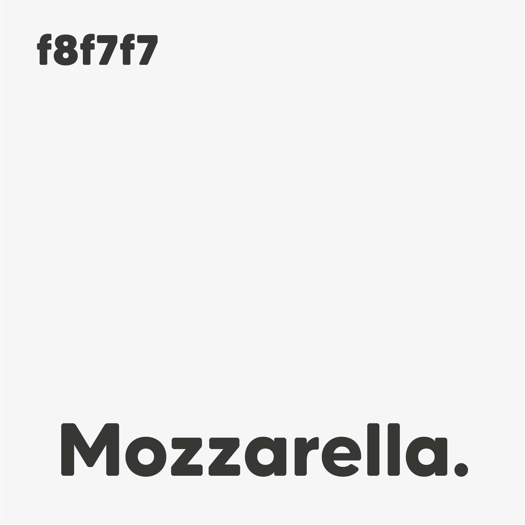
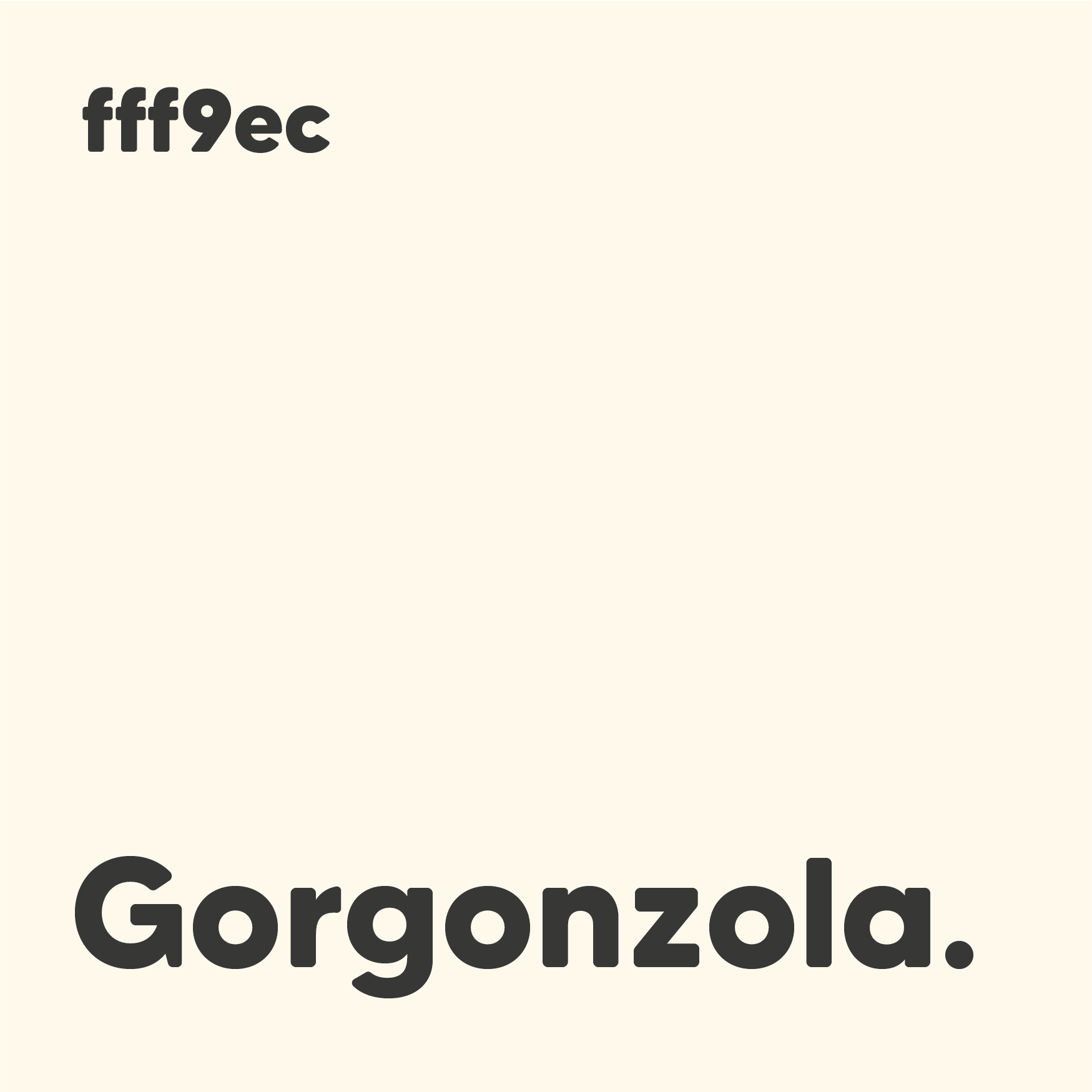
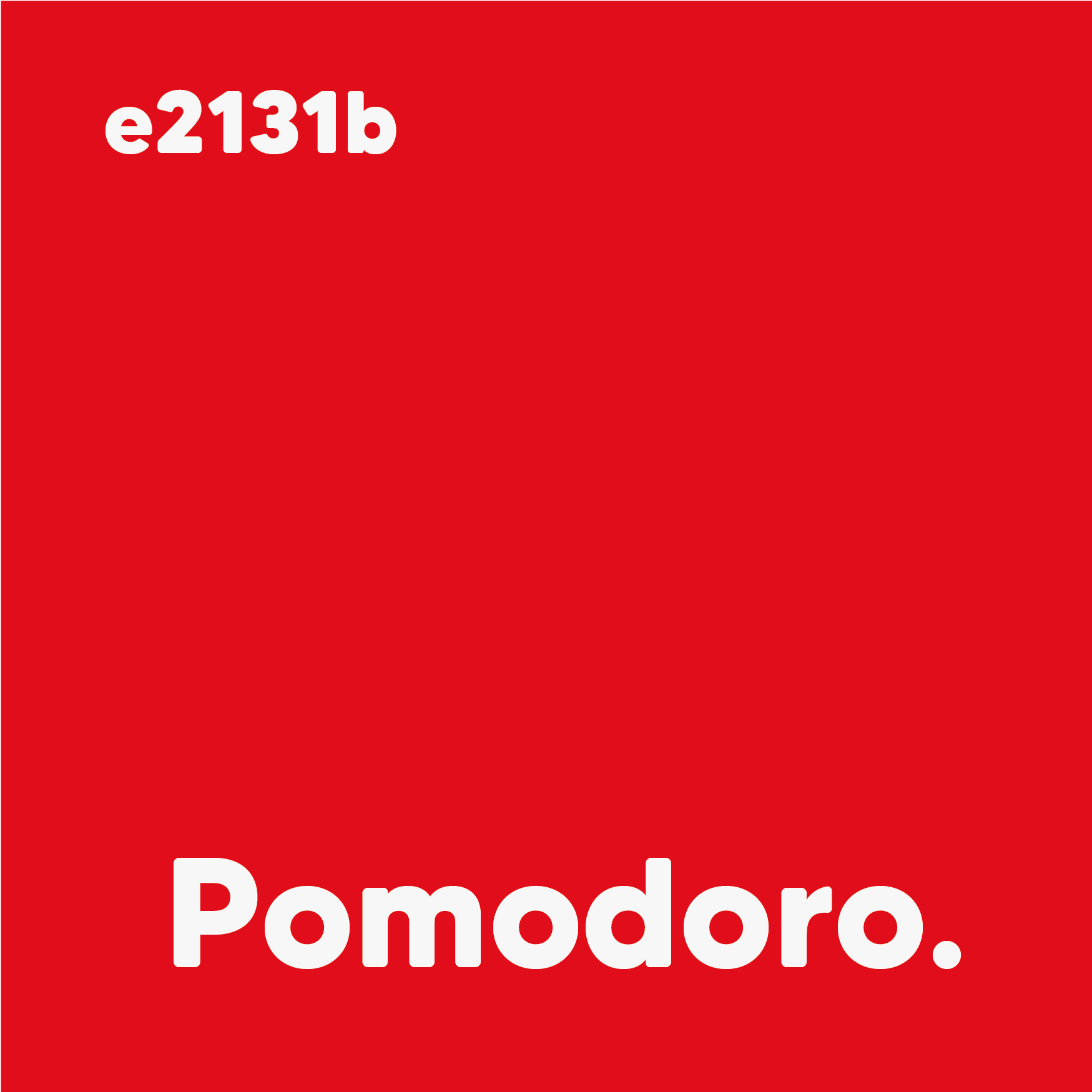
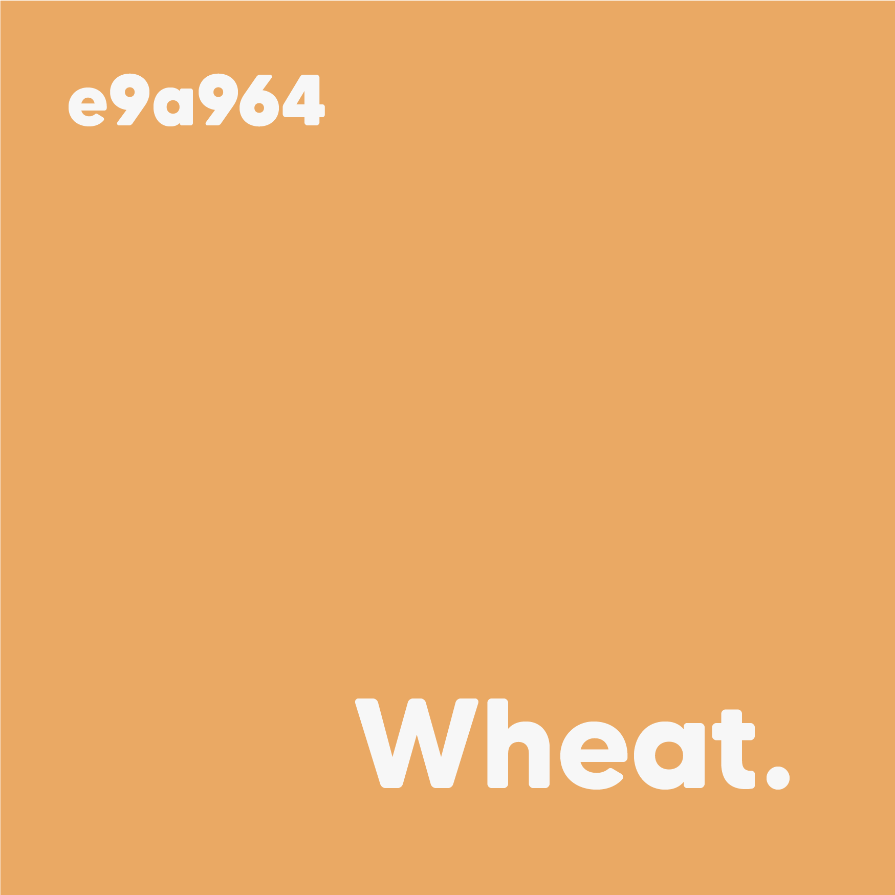
Hey Pesto. is a bold and vibrant brand, so employing bright colours was a must. Inspiration was taken from both the Italian flag and sandwich ingredients to create a playful colour palette that evokes excitement and bold flavours.
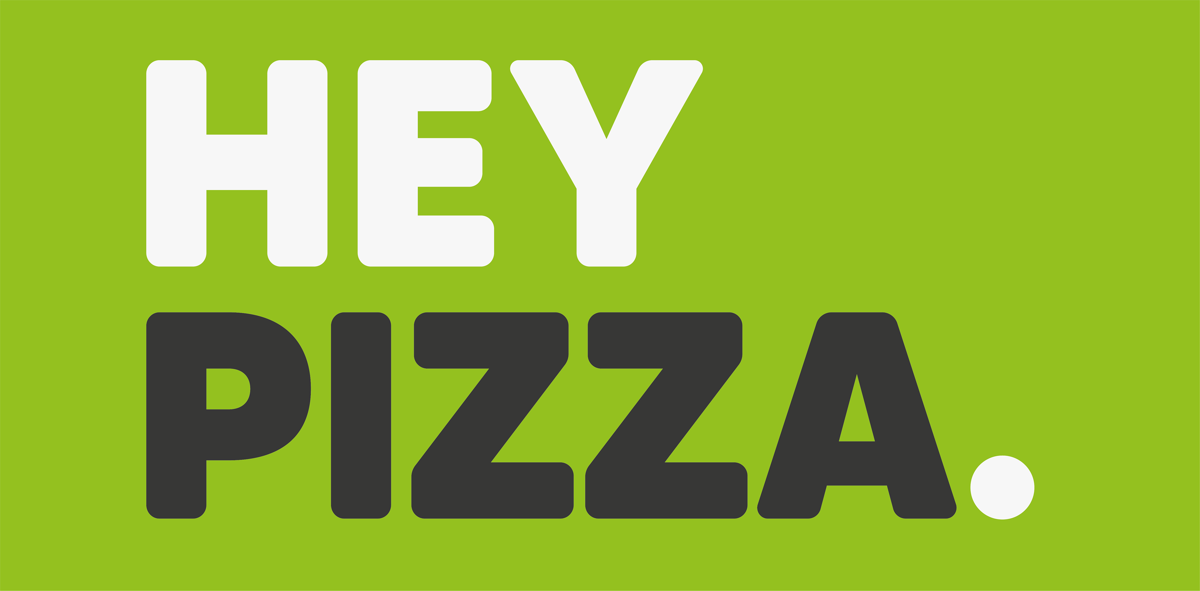
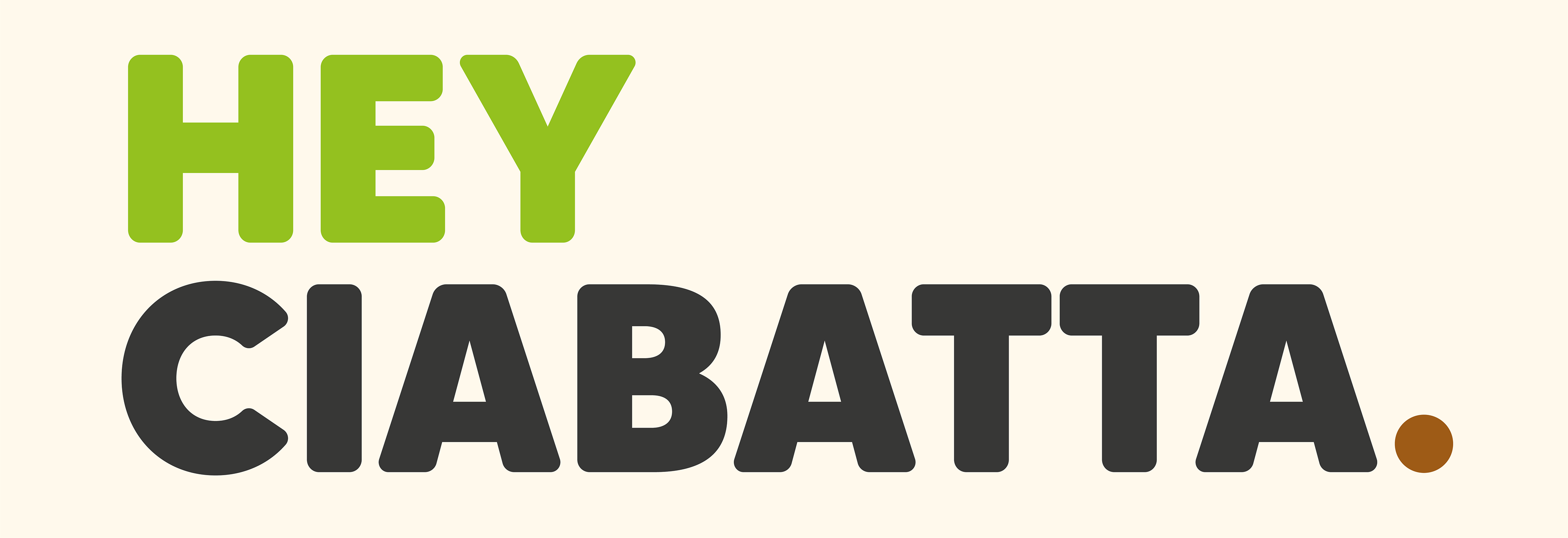
Primary Logo
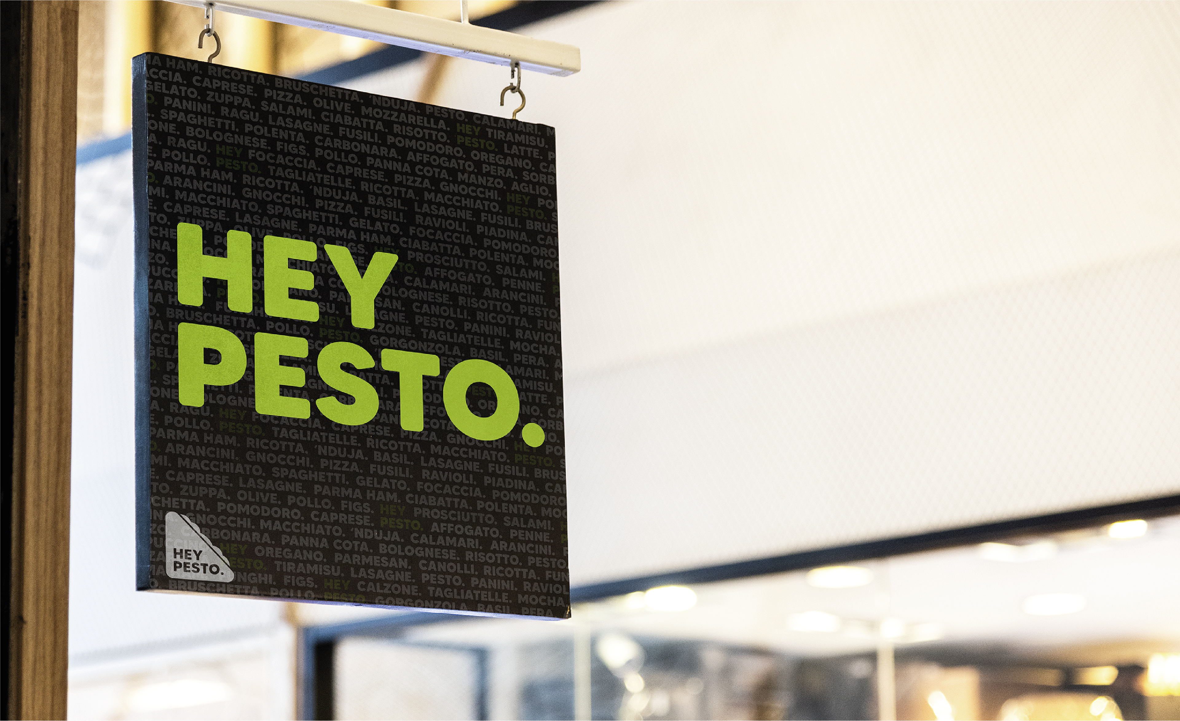
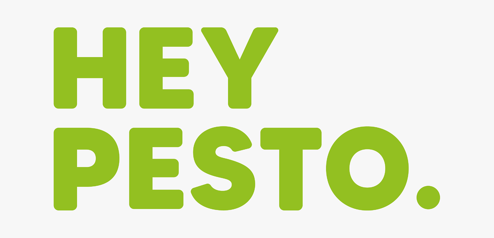
The primary logo for Hey Pesto. is a simple wordmark, utilising a large bold font, bright green text, and a full stop for added emphasis.
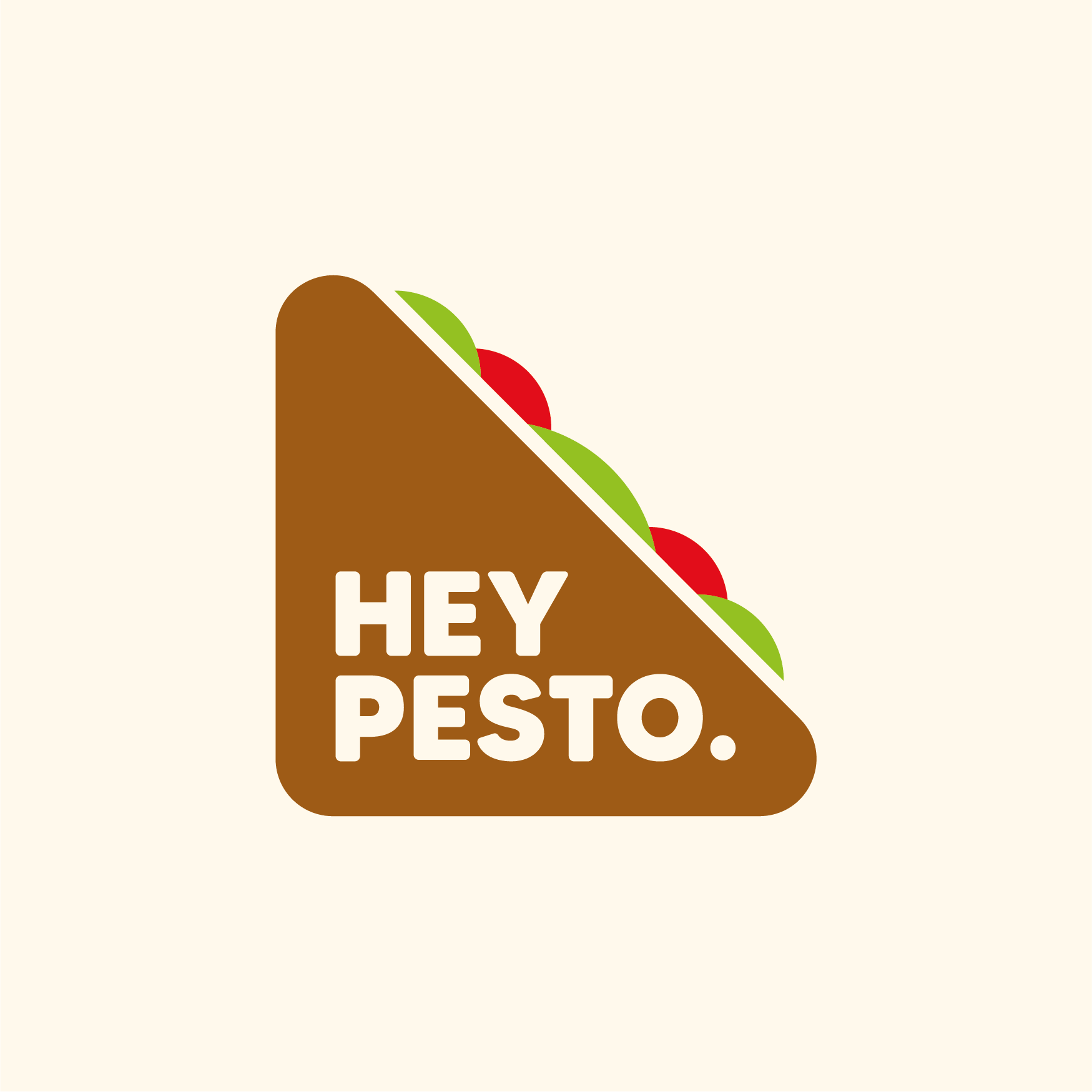
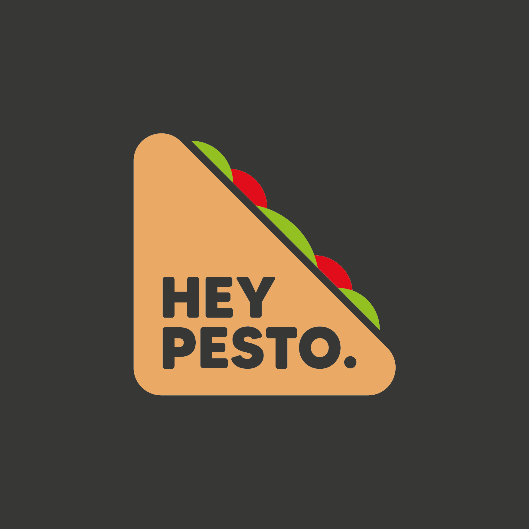
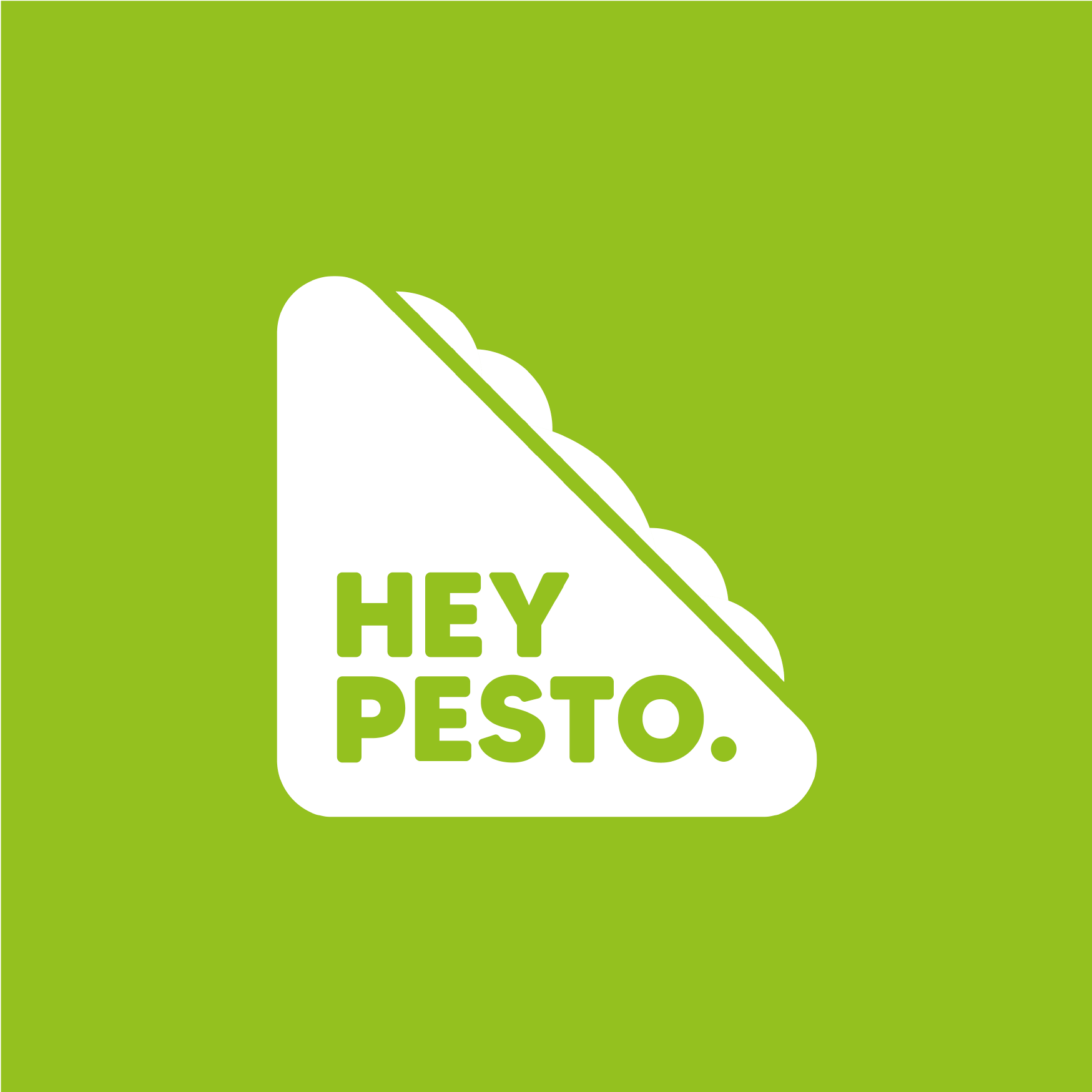
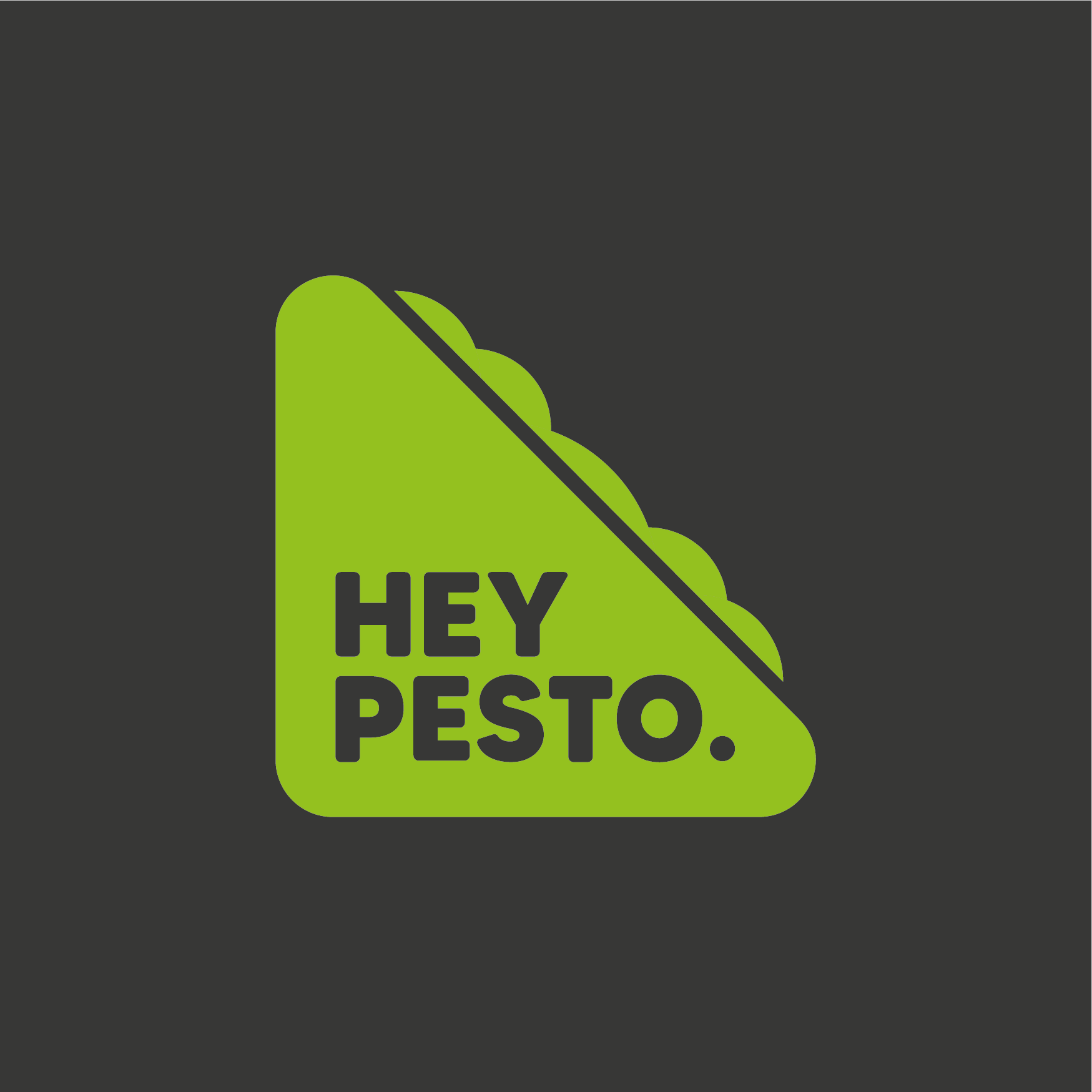
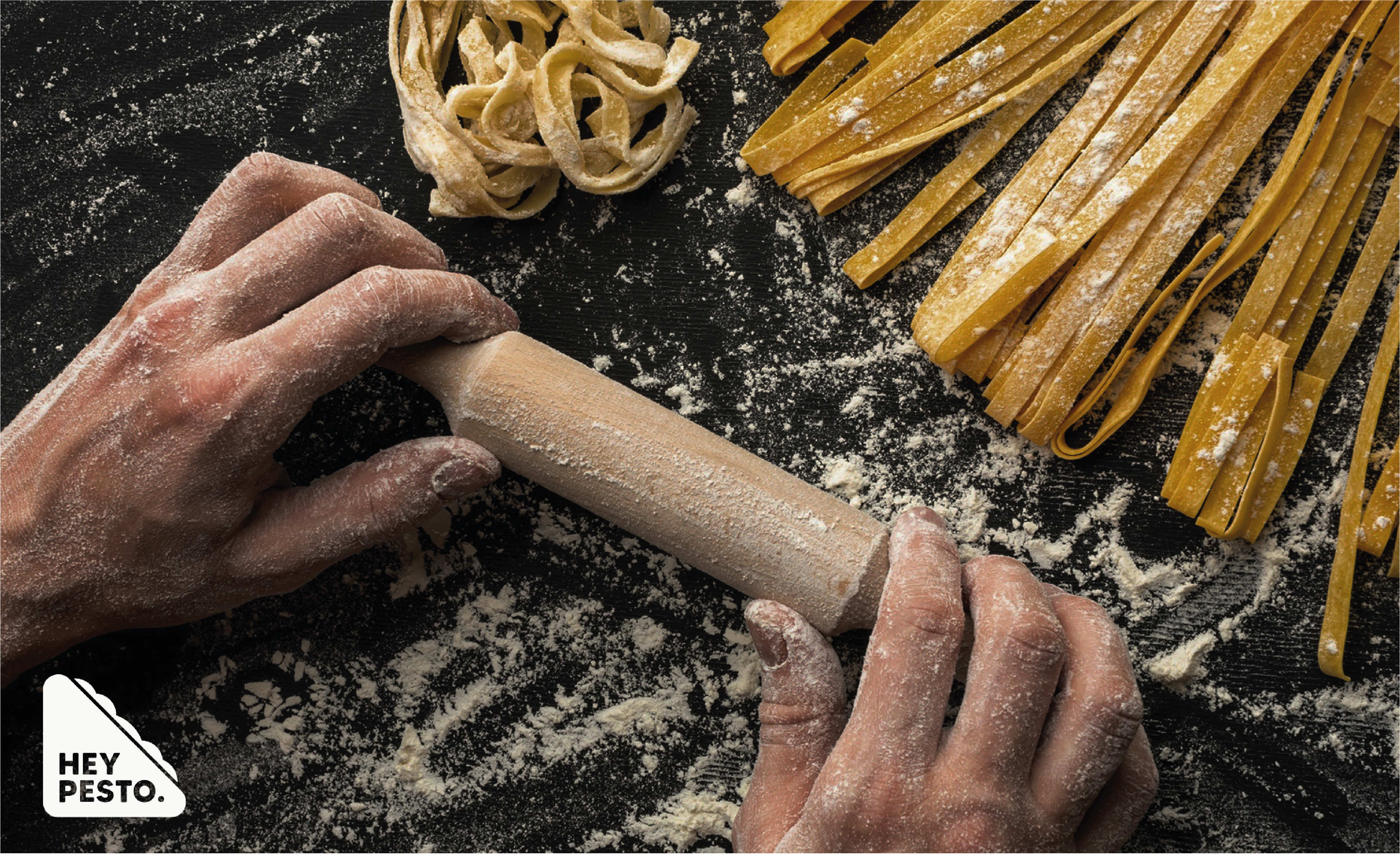
Submark
The submark for Hey Pesto. is a combination mark that houses the logotype within a simple sandwich symbol. The rounded edges are used to evoke a friendly brand, and the simple geometry is adaptable to several colourways.
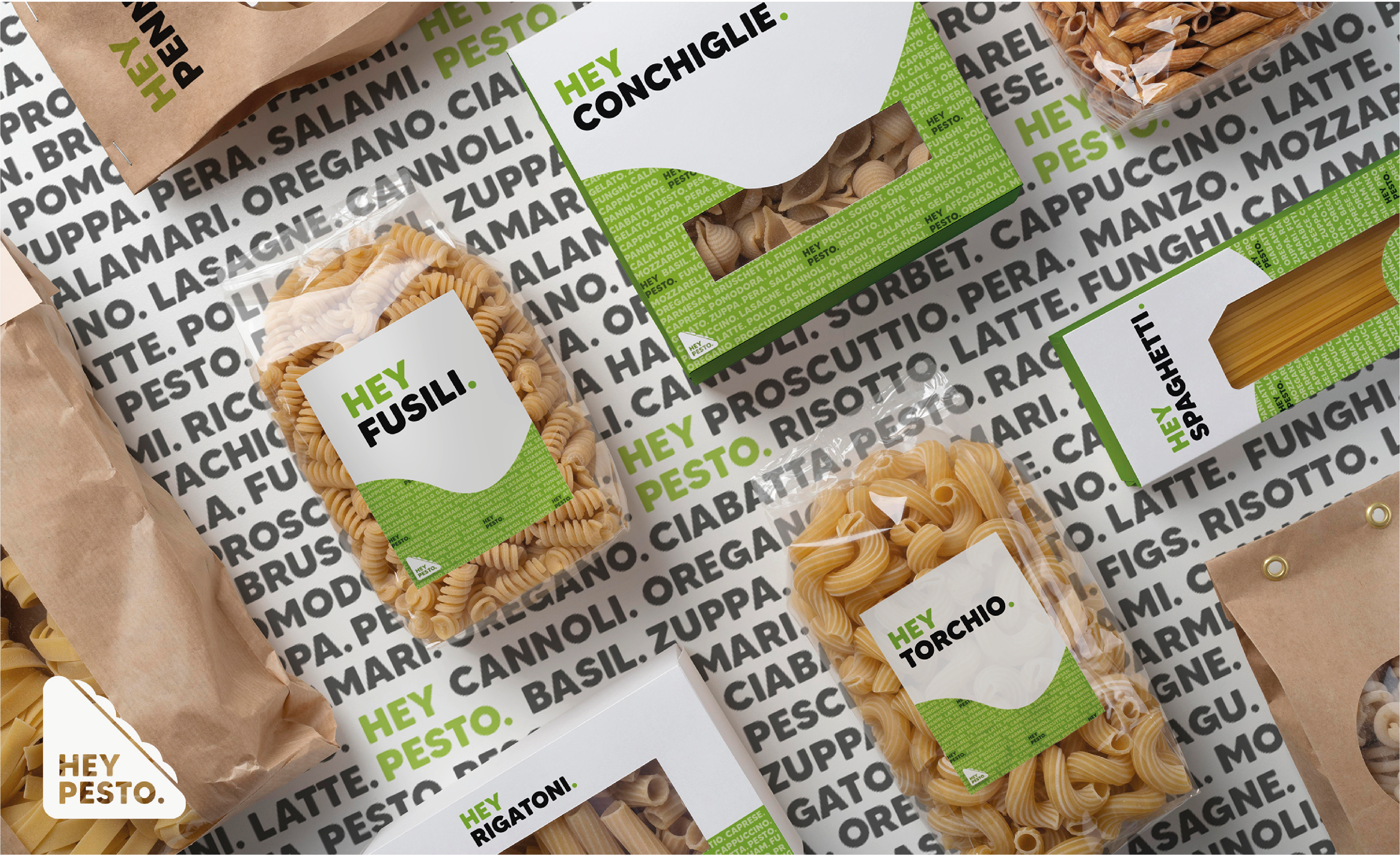
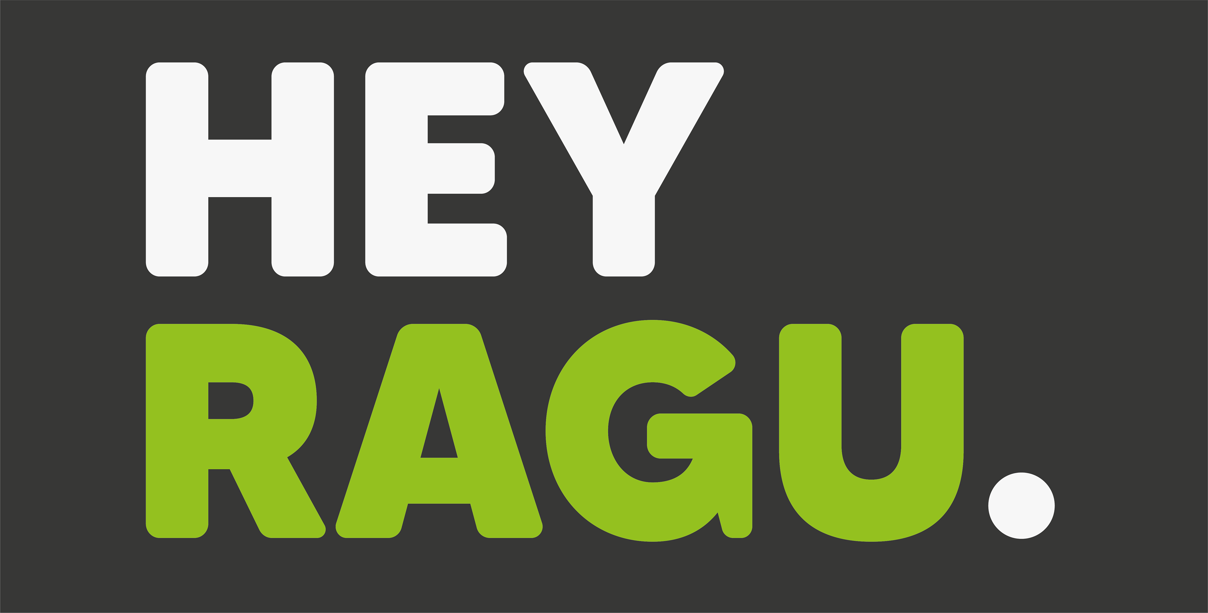
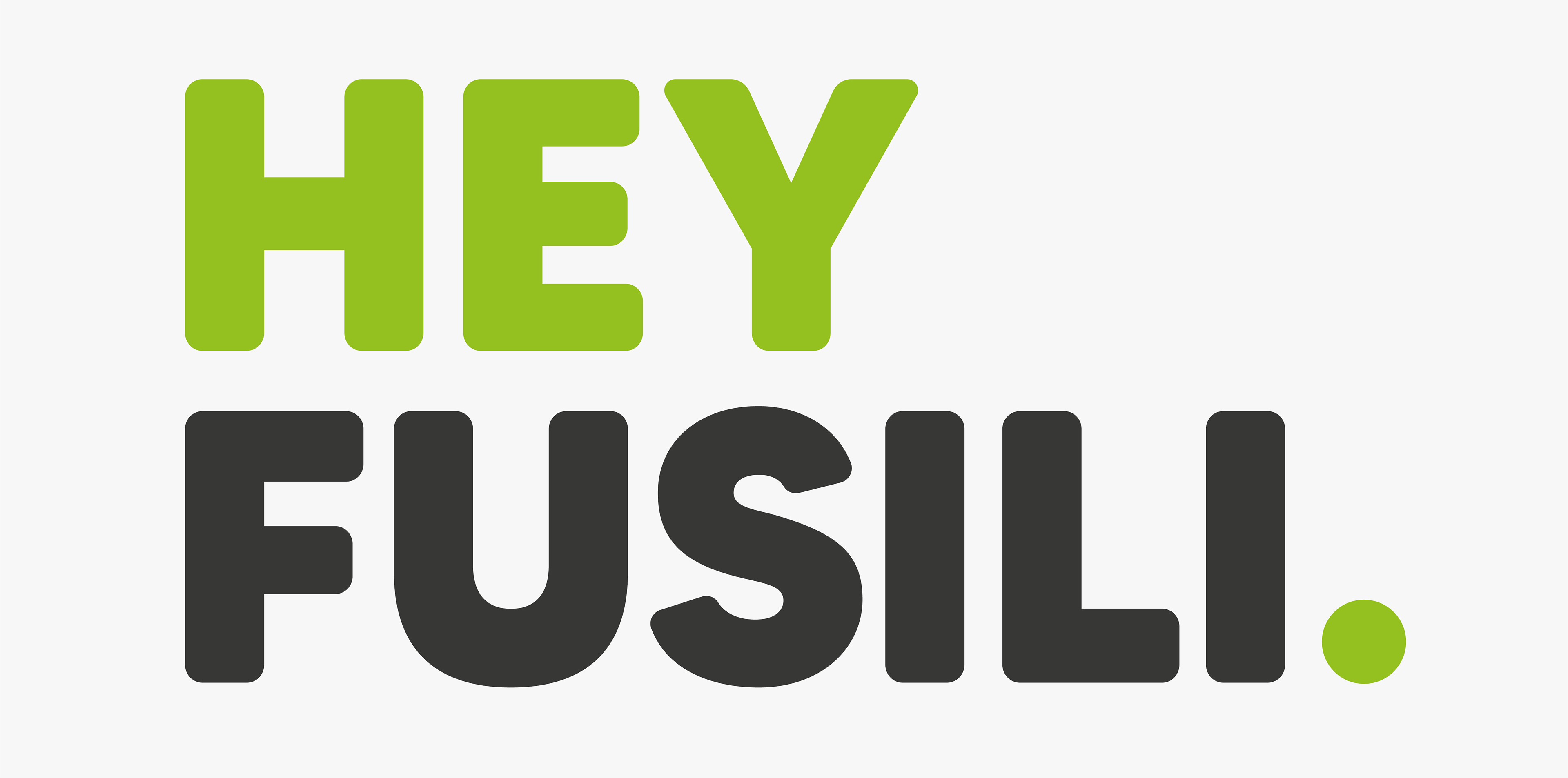
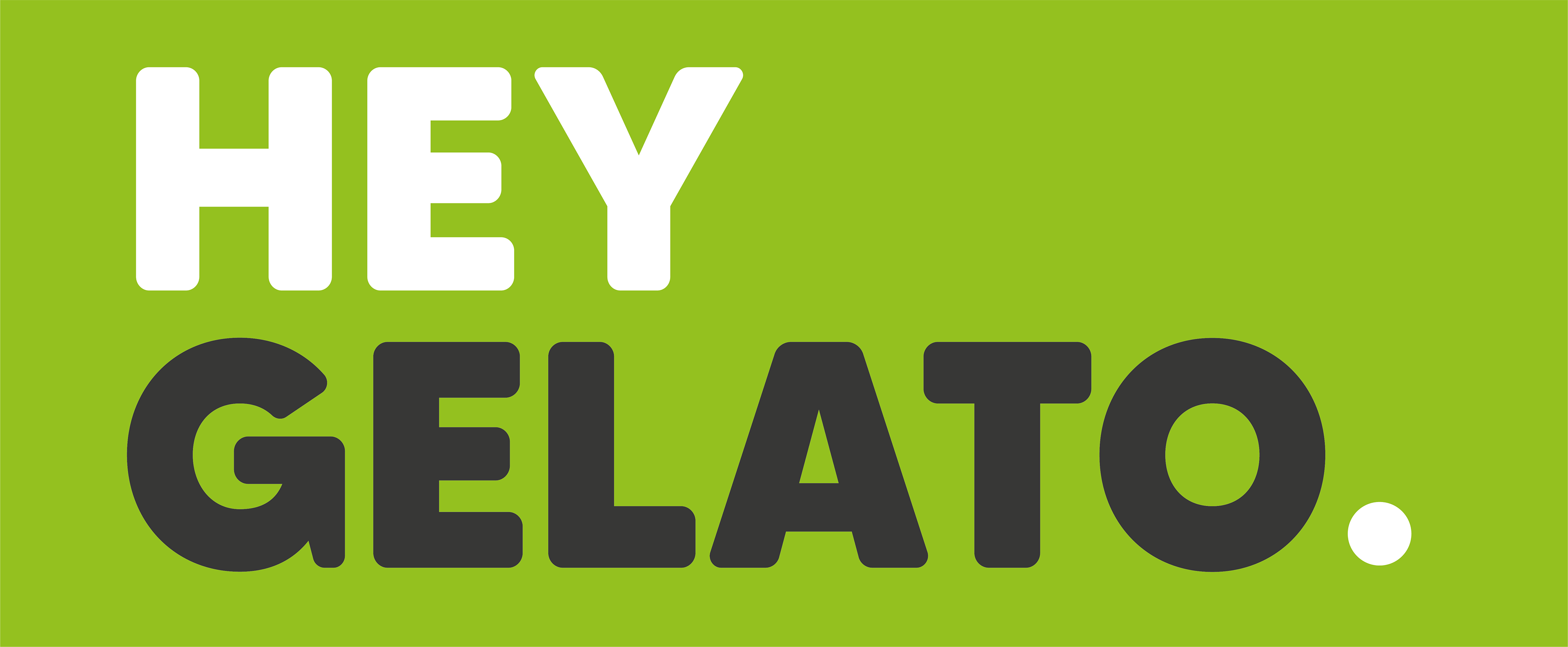
Lockups
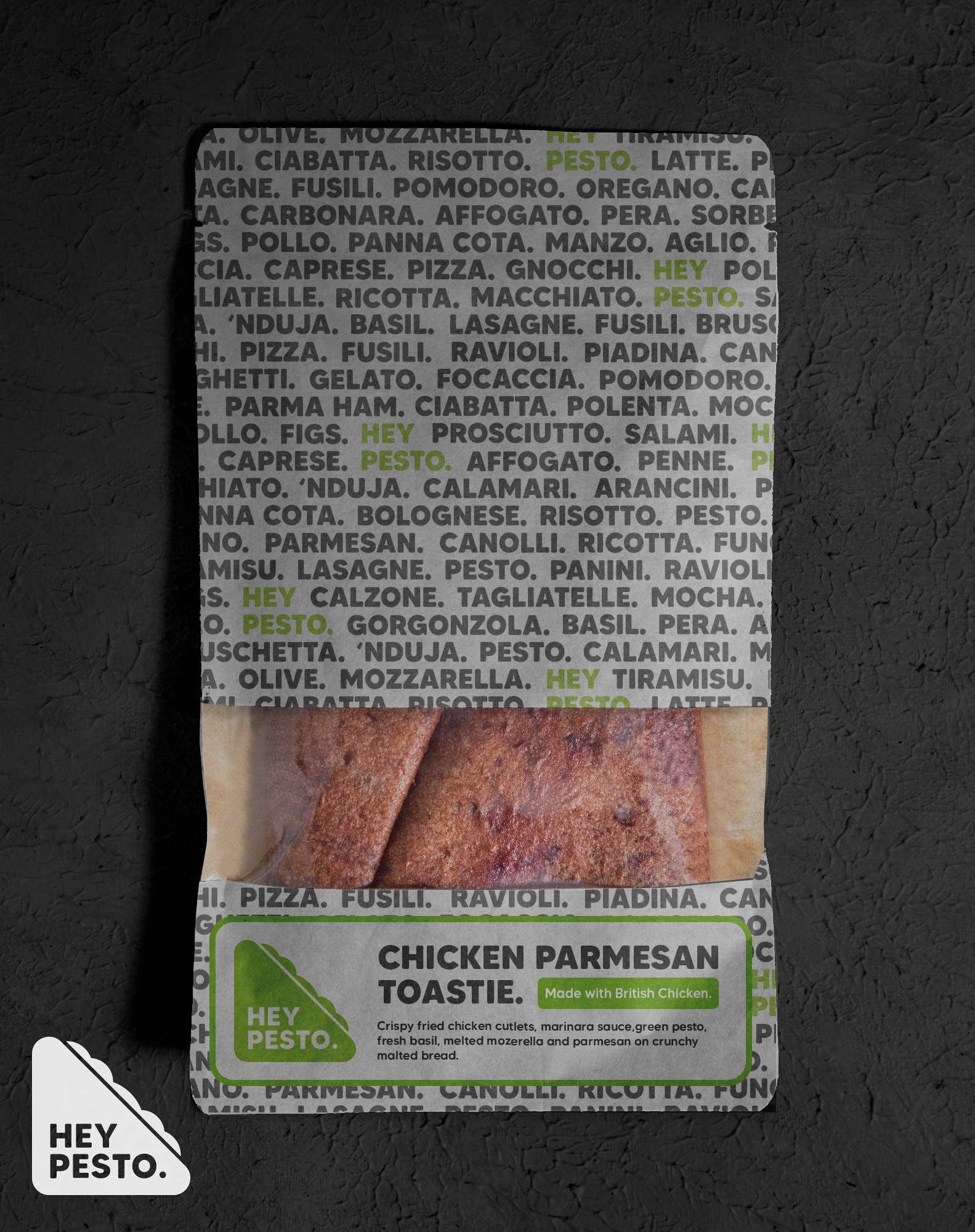
Each food item within Hey Pesto. has its own lockup. These follow the same rules as the primary wordmark; however, the product name is always highlighted in a different colour from the “Hey”.


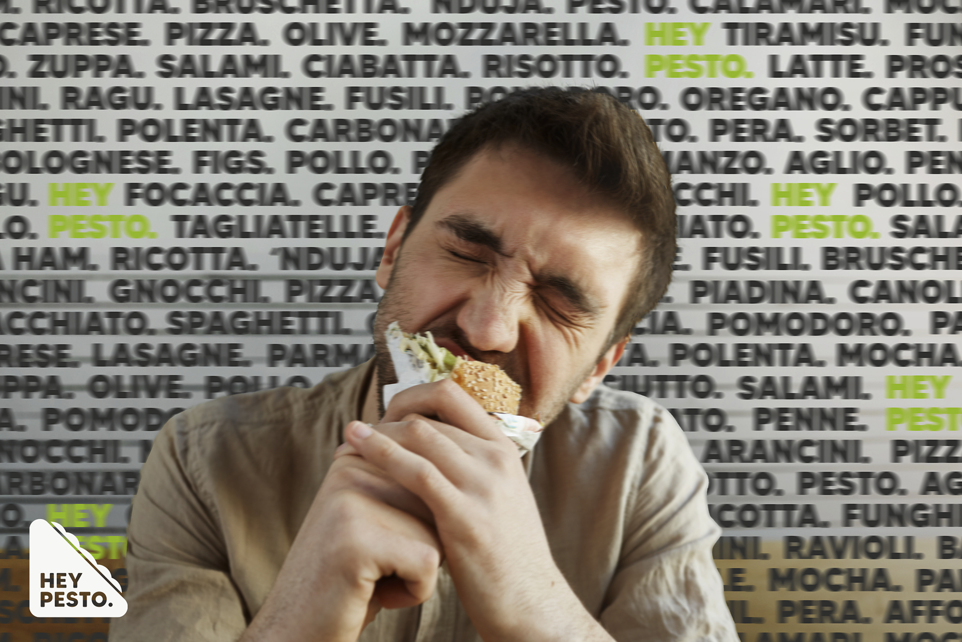
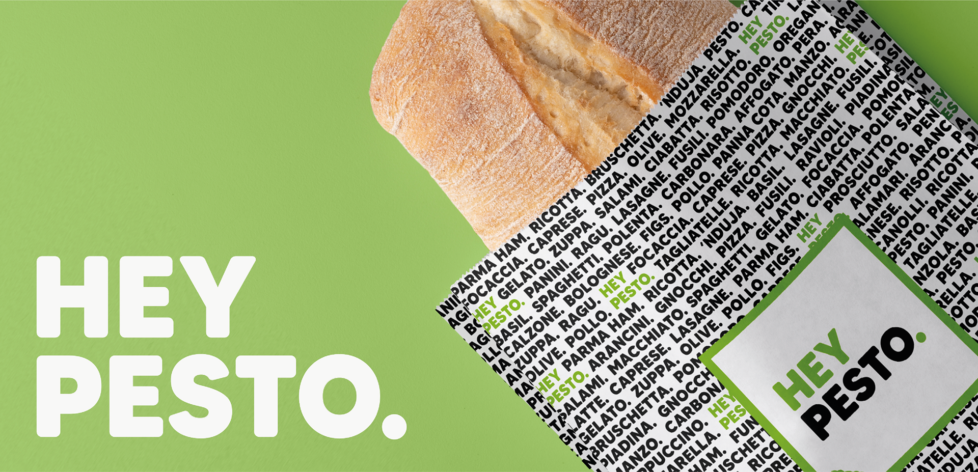
Packaging
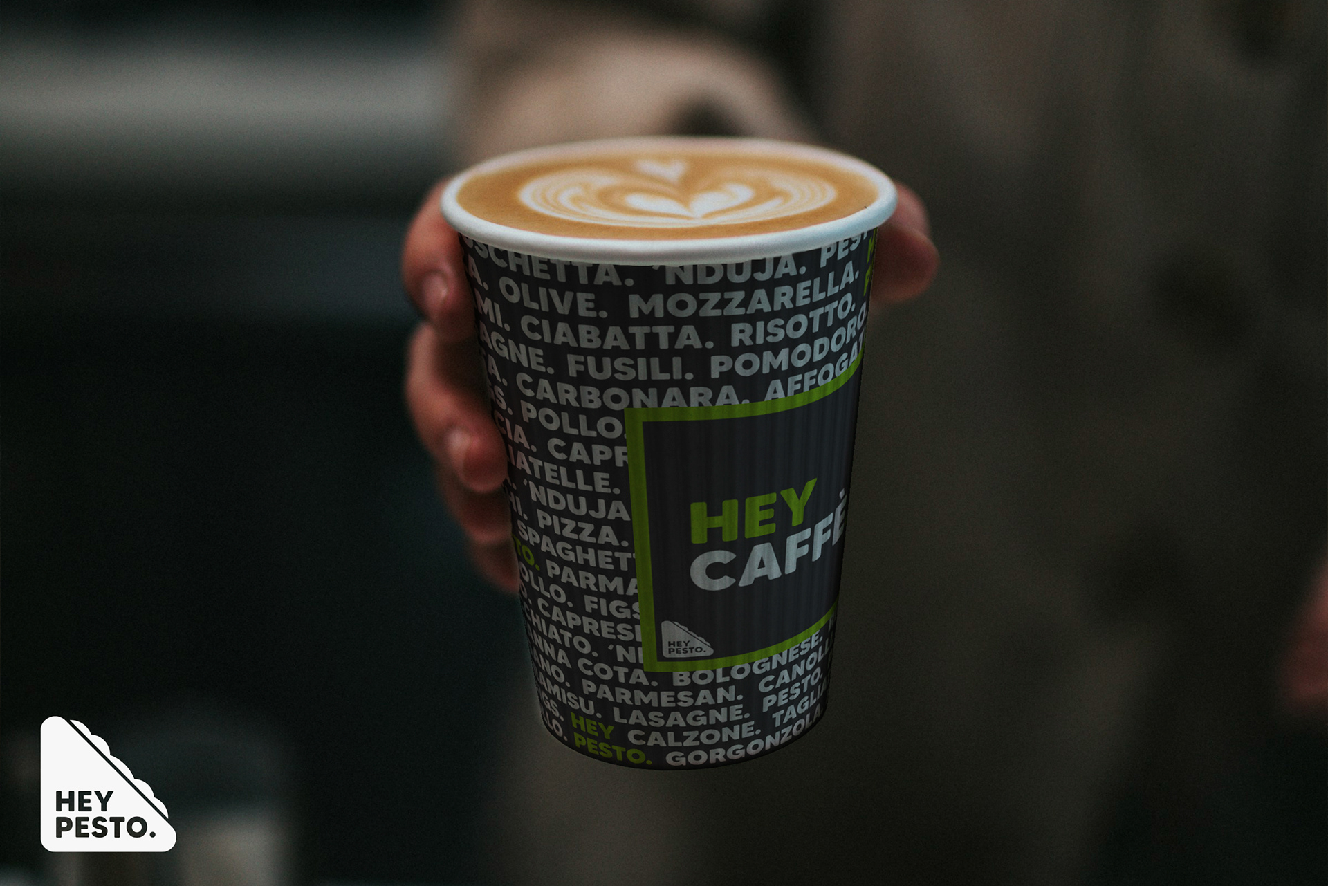
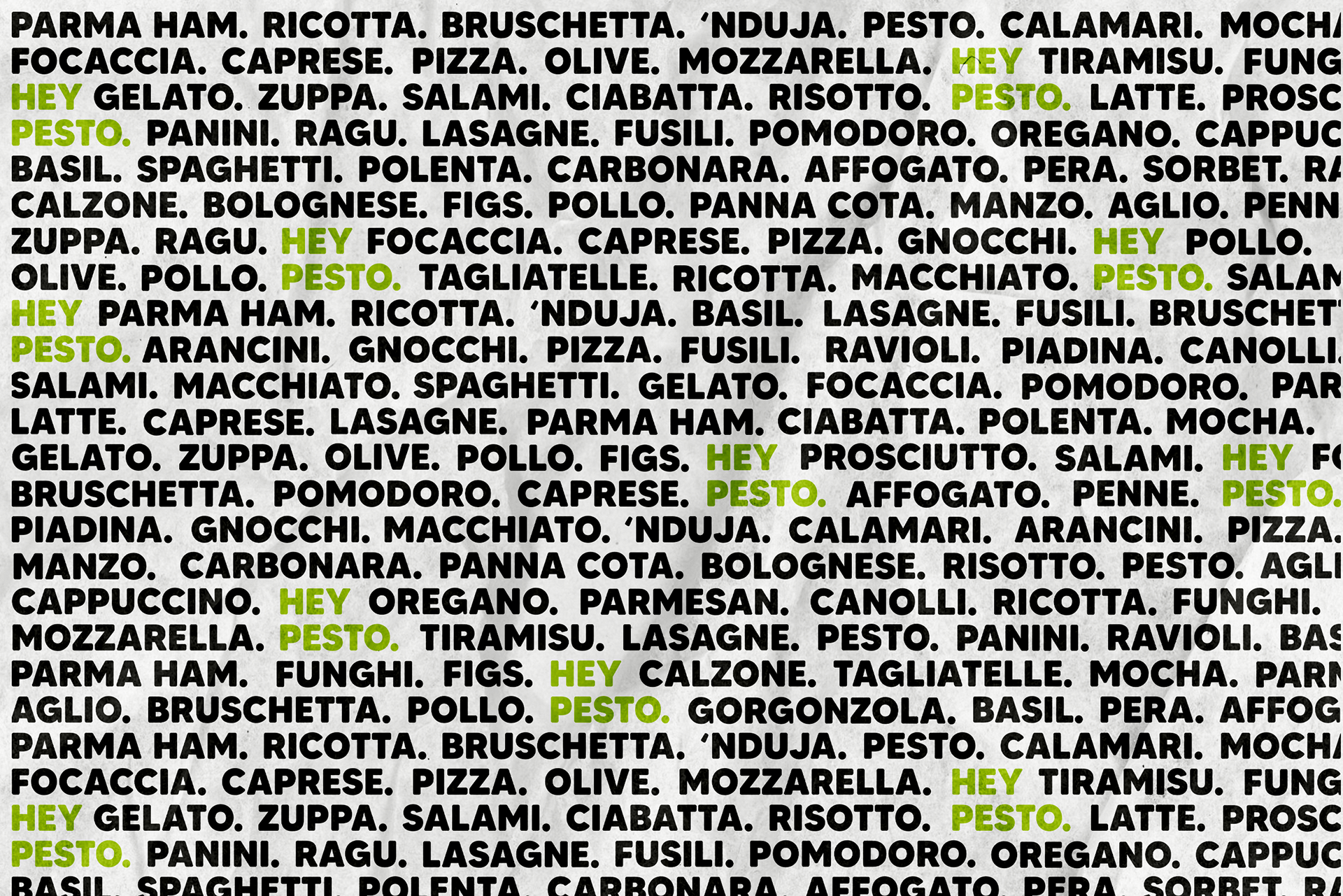
The packaging design for Hey Pesto. is an irregular list of different ingredients and dishes that are served and used in the restaurant, where possible, the Italian translation has been used.