Context
Lodge Inn is a contemporary urban hotel with multiple locations worldwide. With a focus on short to mid-term city breaks, Lodge Inn aims to provide its guests (mainly urban travellers and digital nomads) with the amenities to facilitate a memorable trip.
Industry
Hospitality
Role
Brand Designer
Services
Brand Design, Logo Design
Tools
Adobe Illustrator, Photoshop
Identity
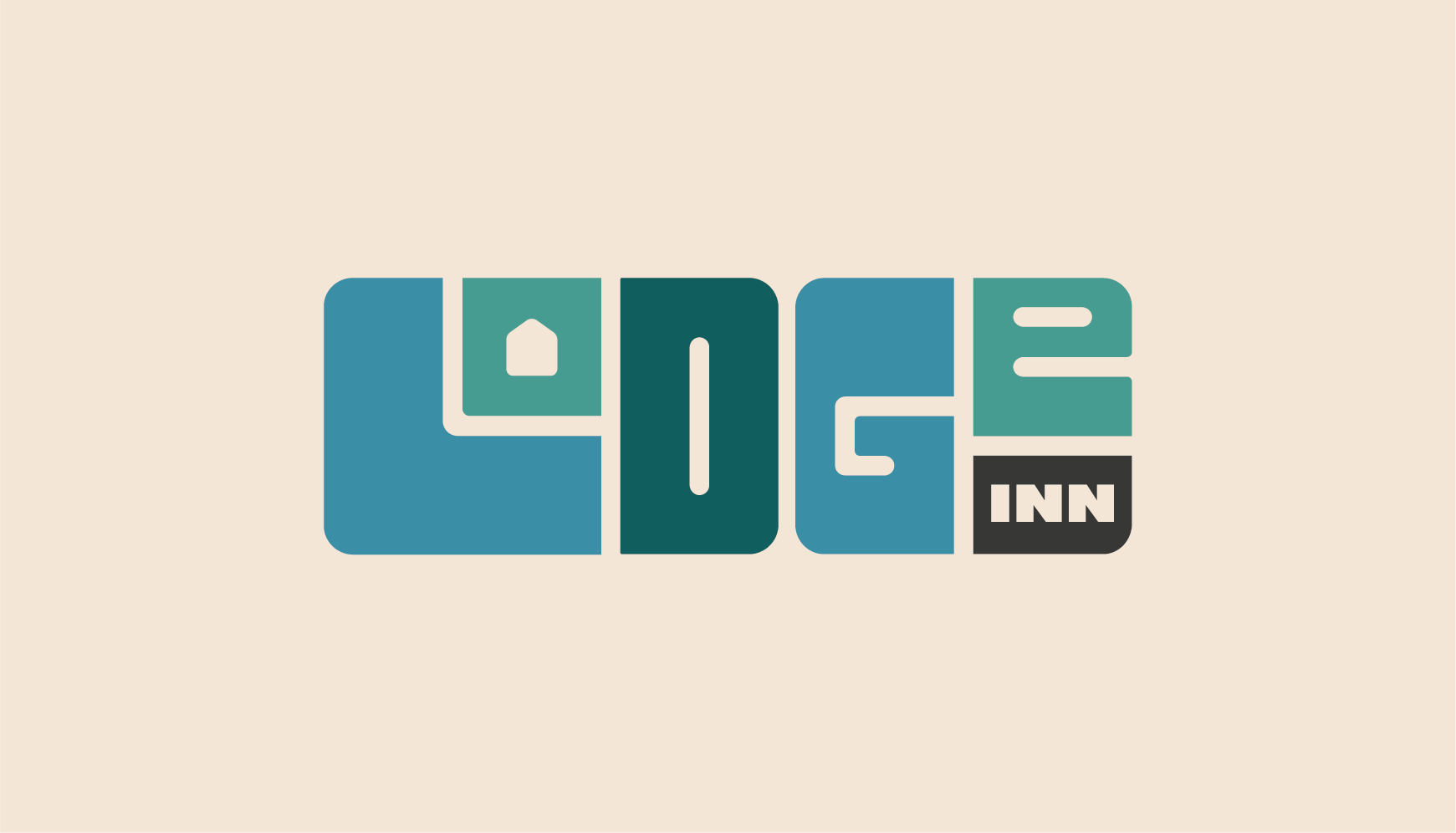
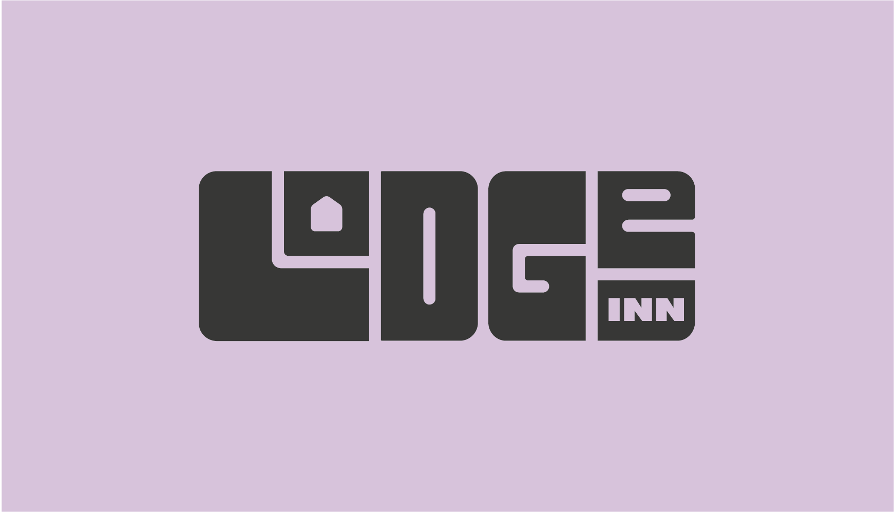
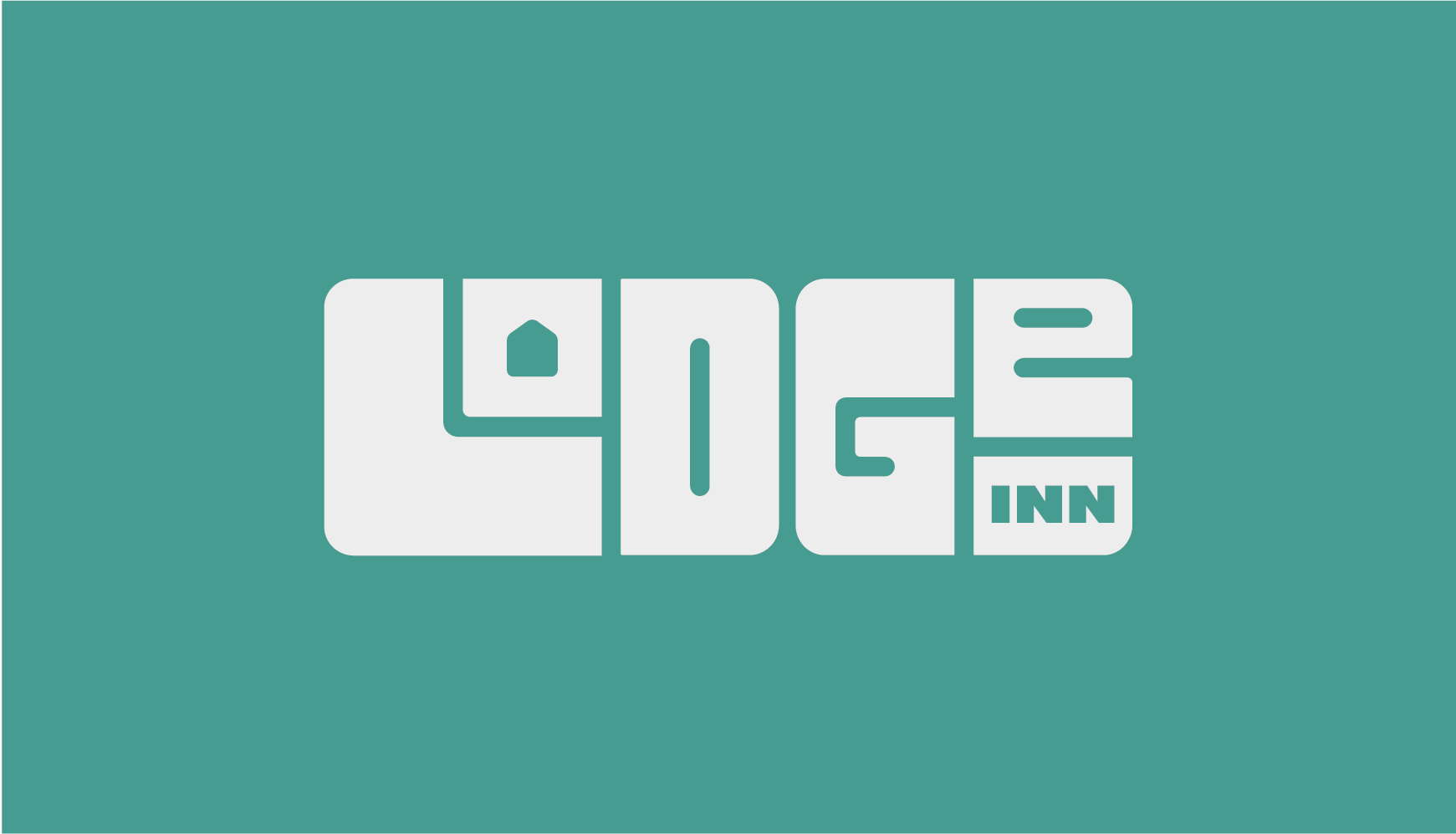
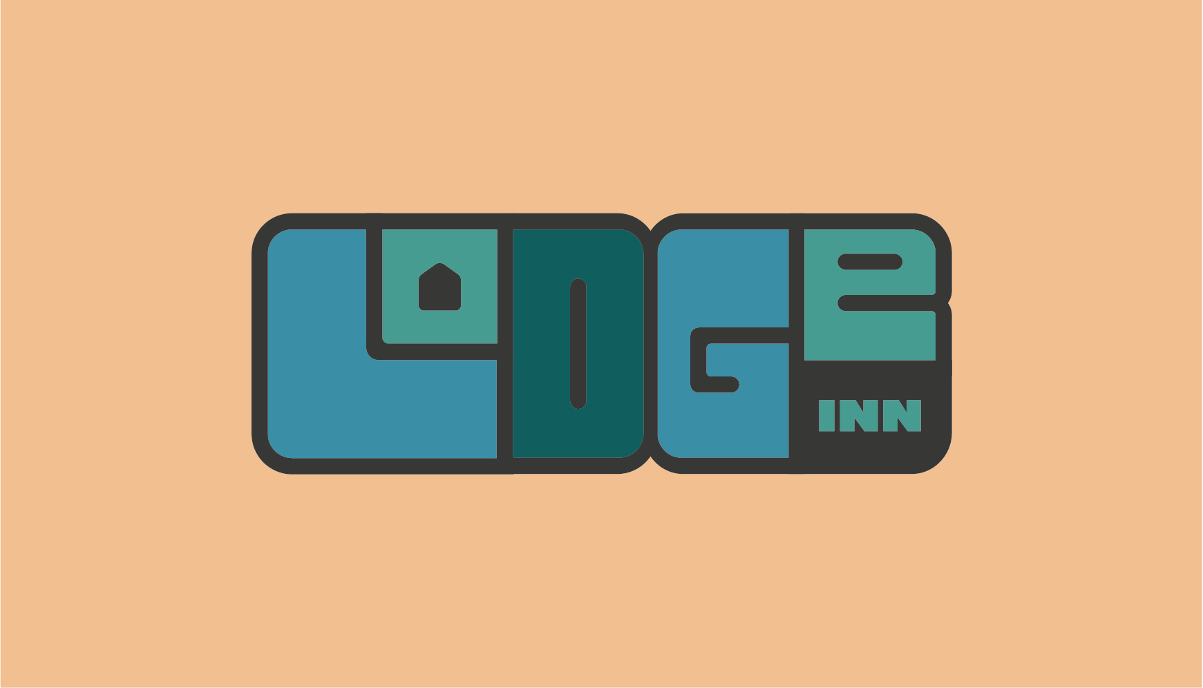
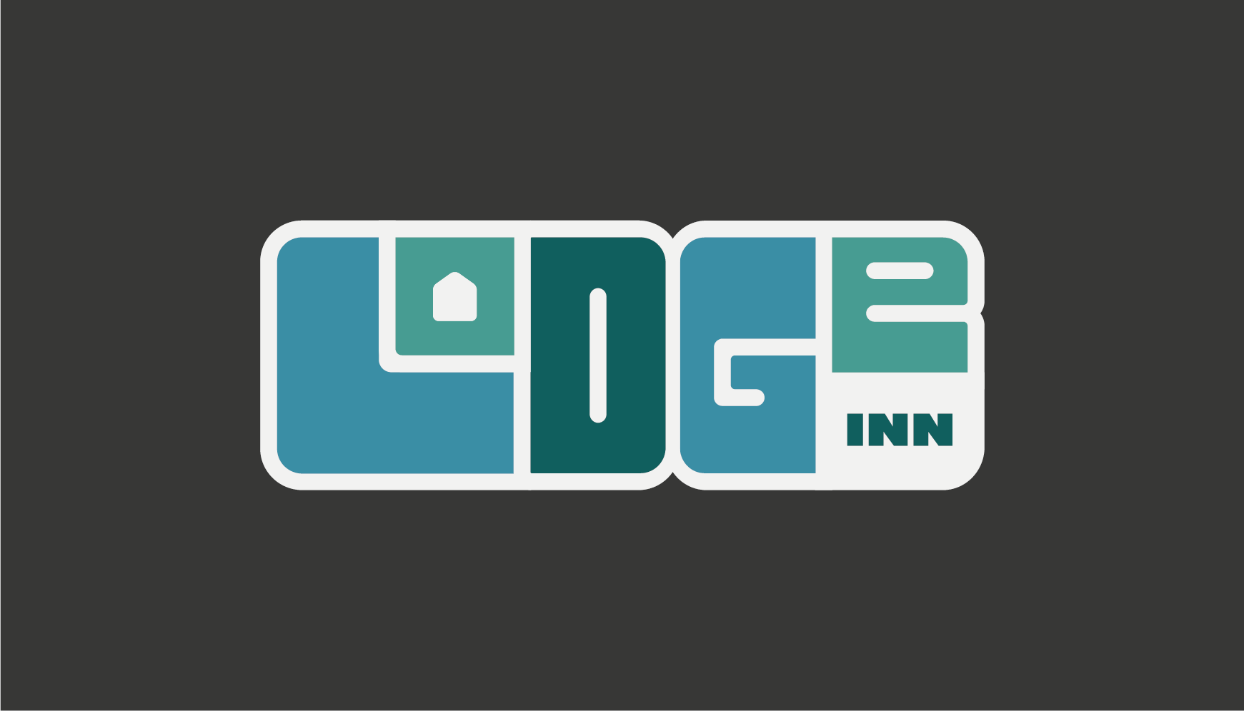
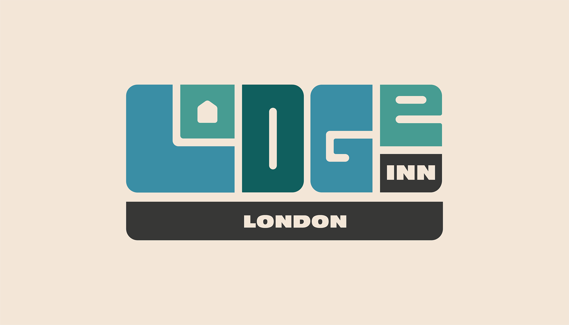
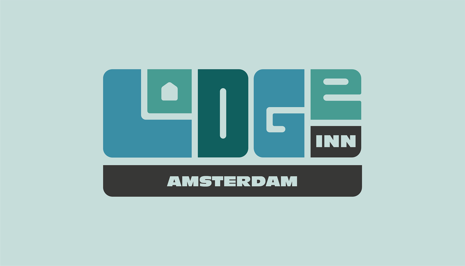
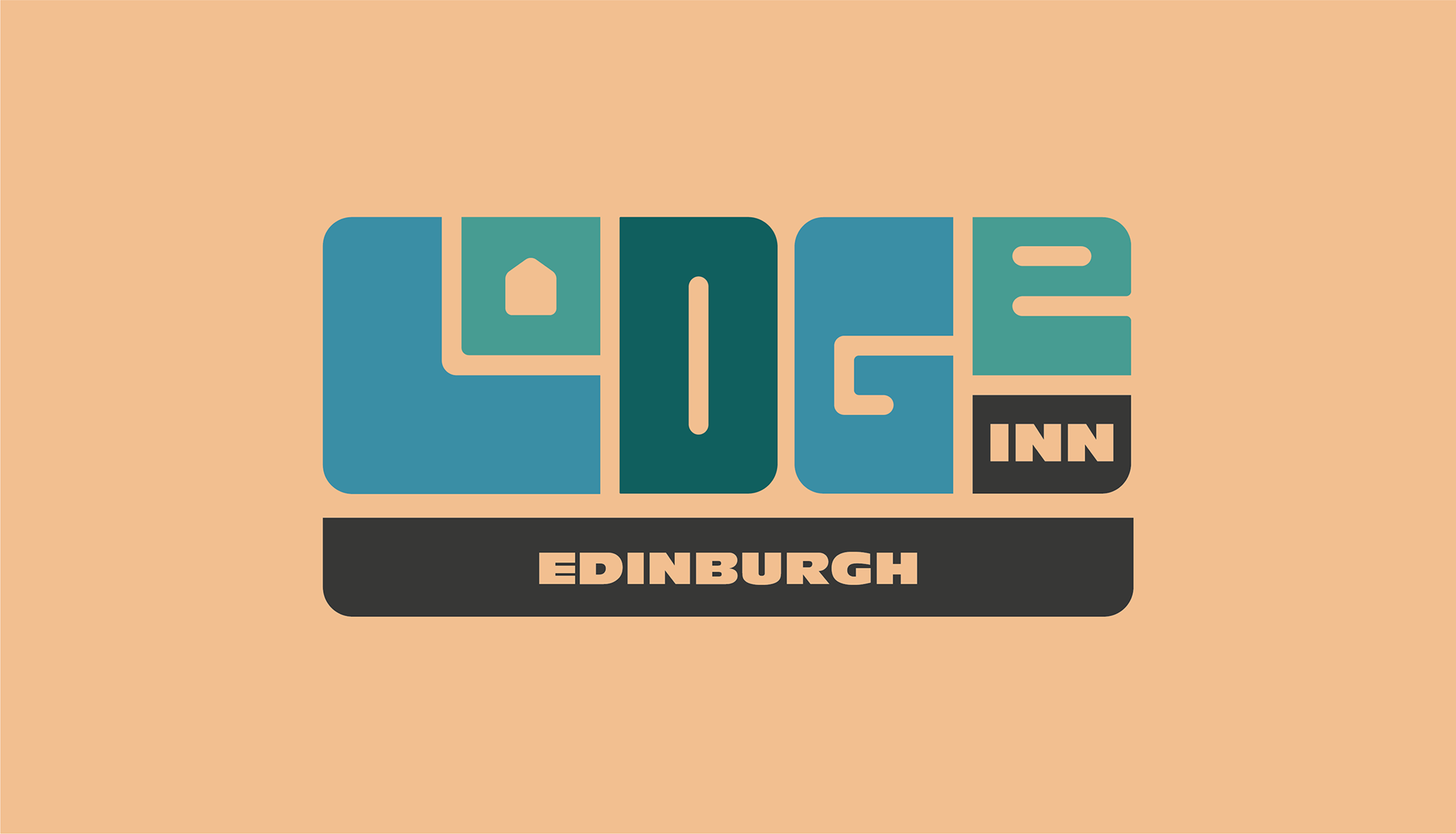
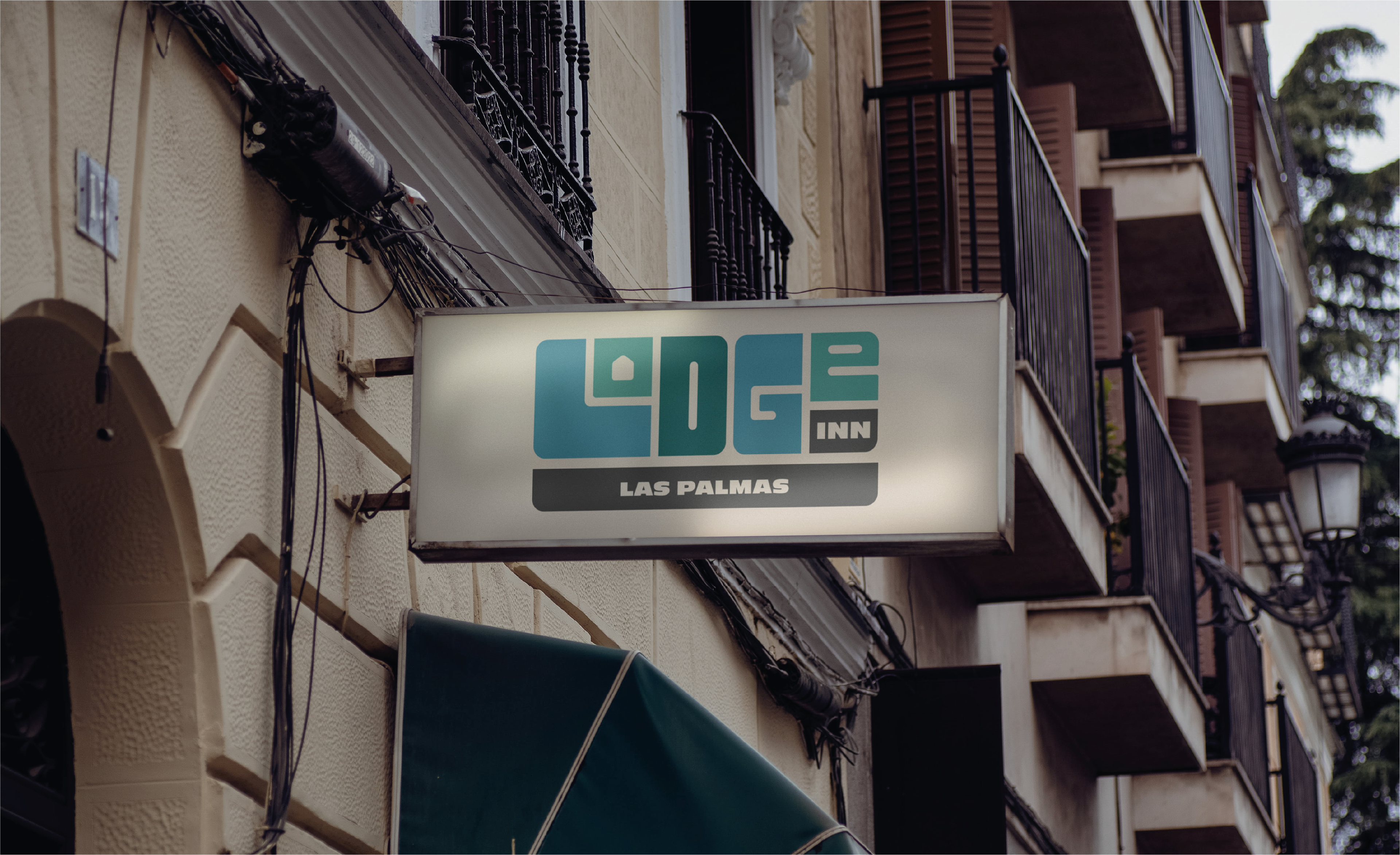
Modernity and snuggness was the name of the game when it came to Lodge Inn’s identity, with friendly curves and closeness throughout.
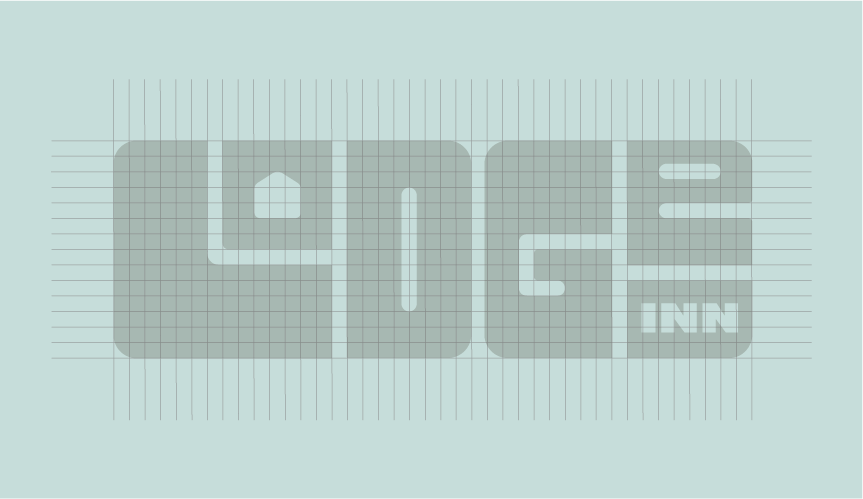
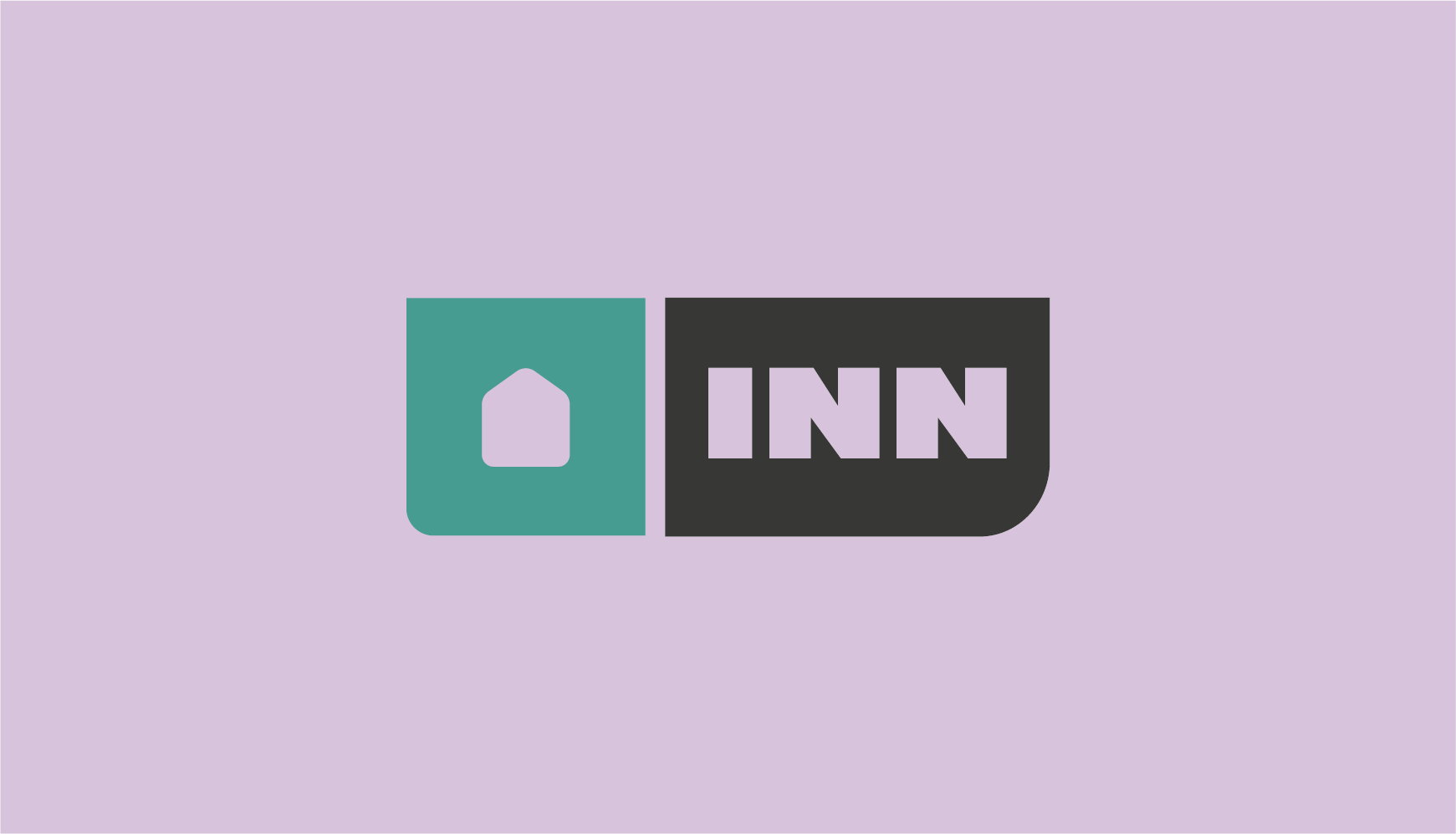
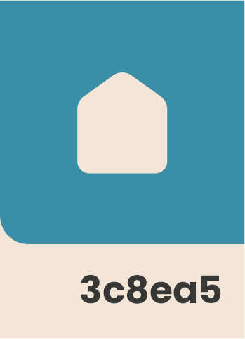
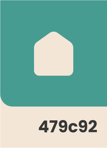
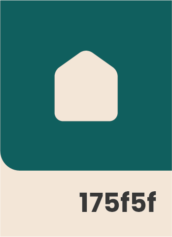
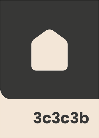
The logo continues that philosophy with closely aligned custom block lettering spaced on a modular grid. This, along with the house icon within the 'O', suggests a home away from home and emphasises the dual meaning of “Lodge” in Lodge Inn.
Logomark
The logomark combines the elements of the house icon and “inn block”, whereas the submark is derived from the O within the primary logo.
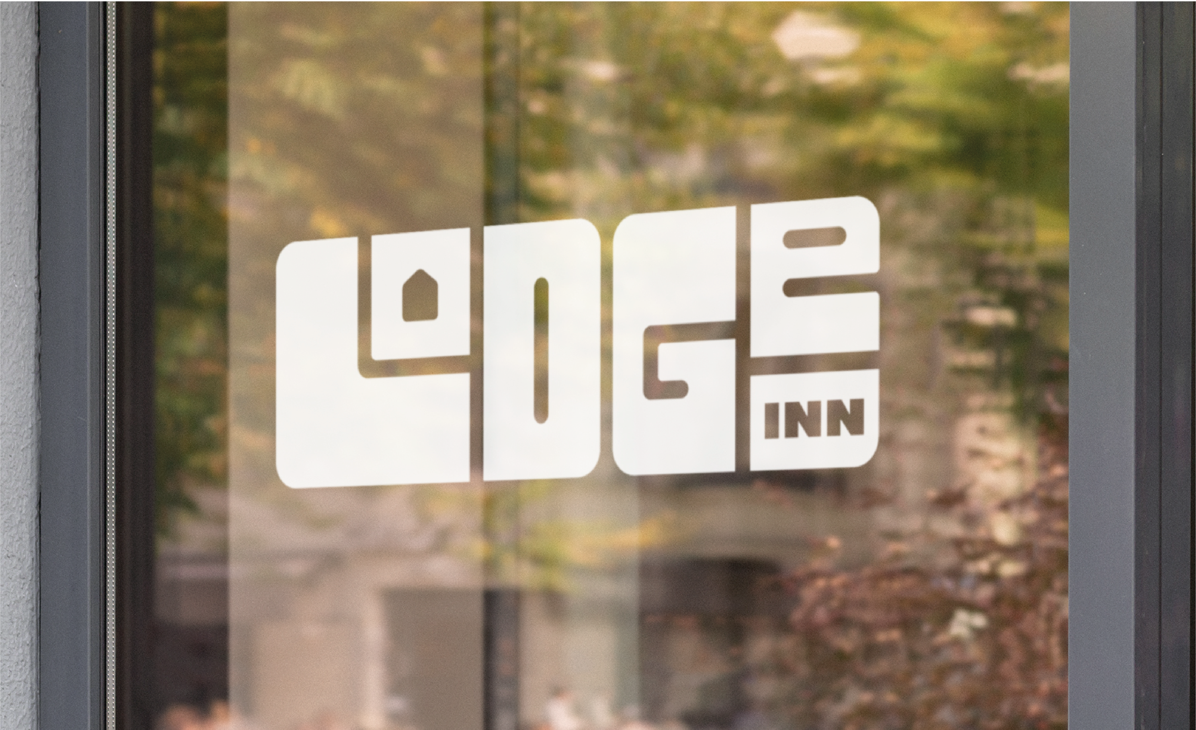


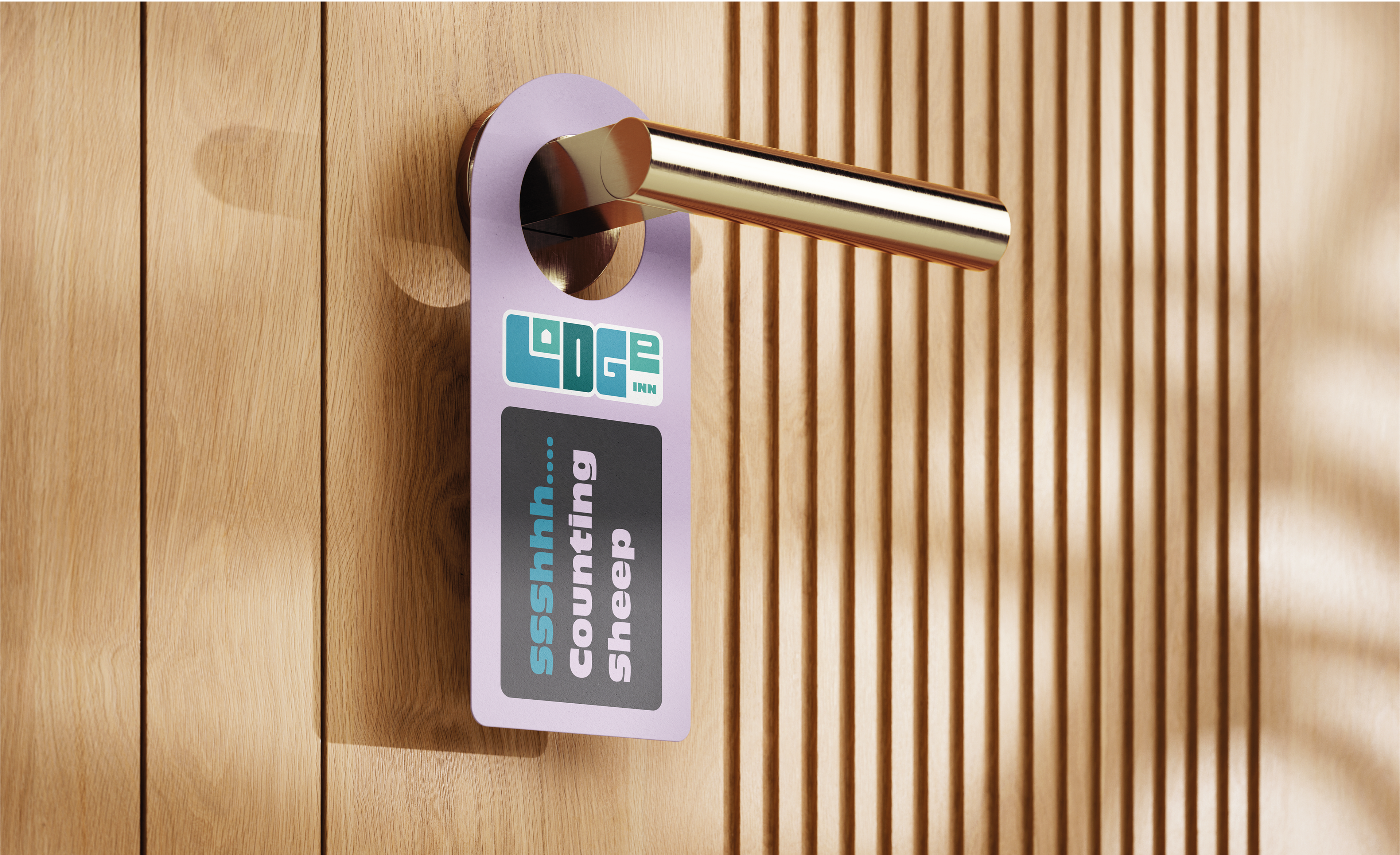
Lockups
Location lockups are to be used for different city locations, these consist of the main logo and a simple charcoal strip with the corresponding locations.


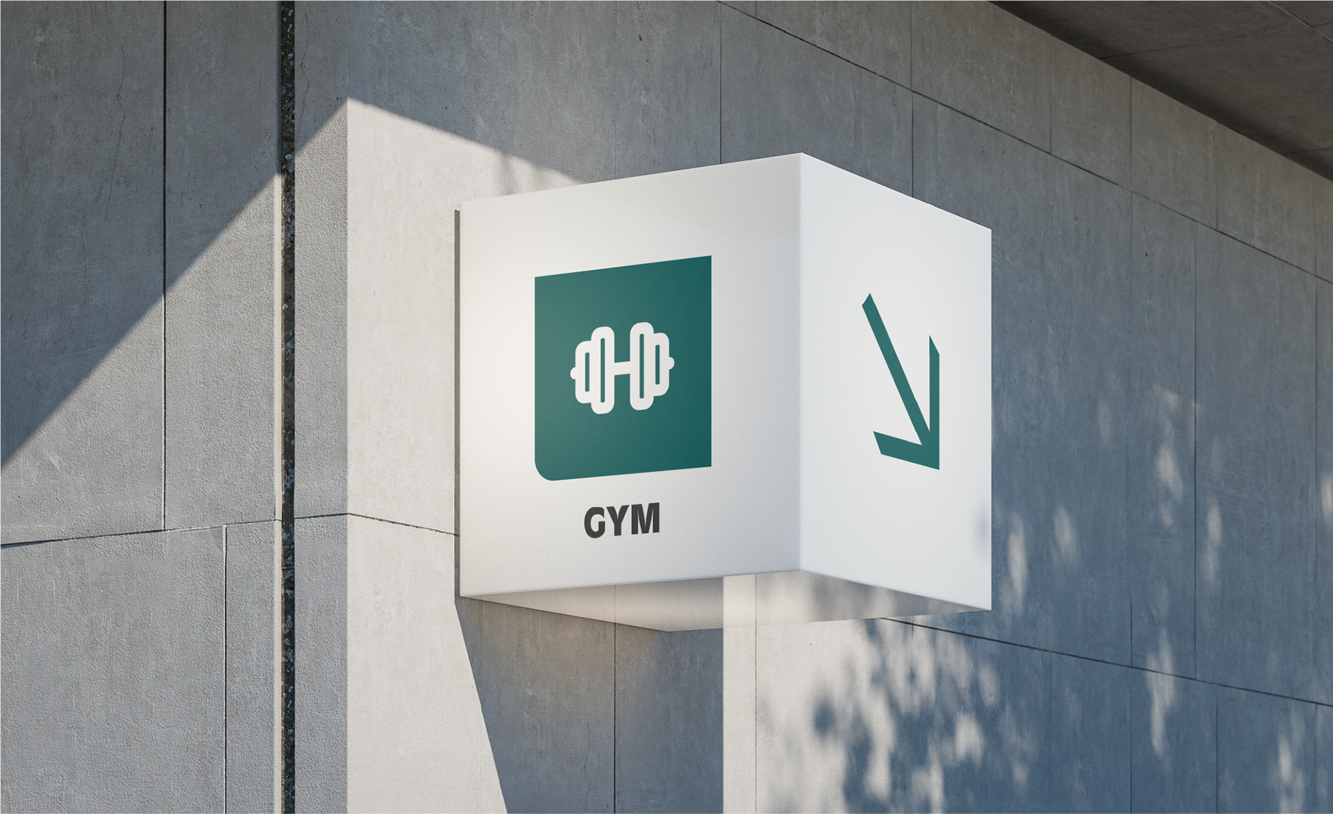
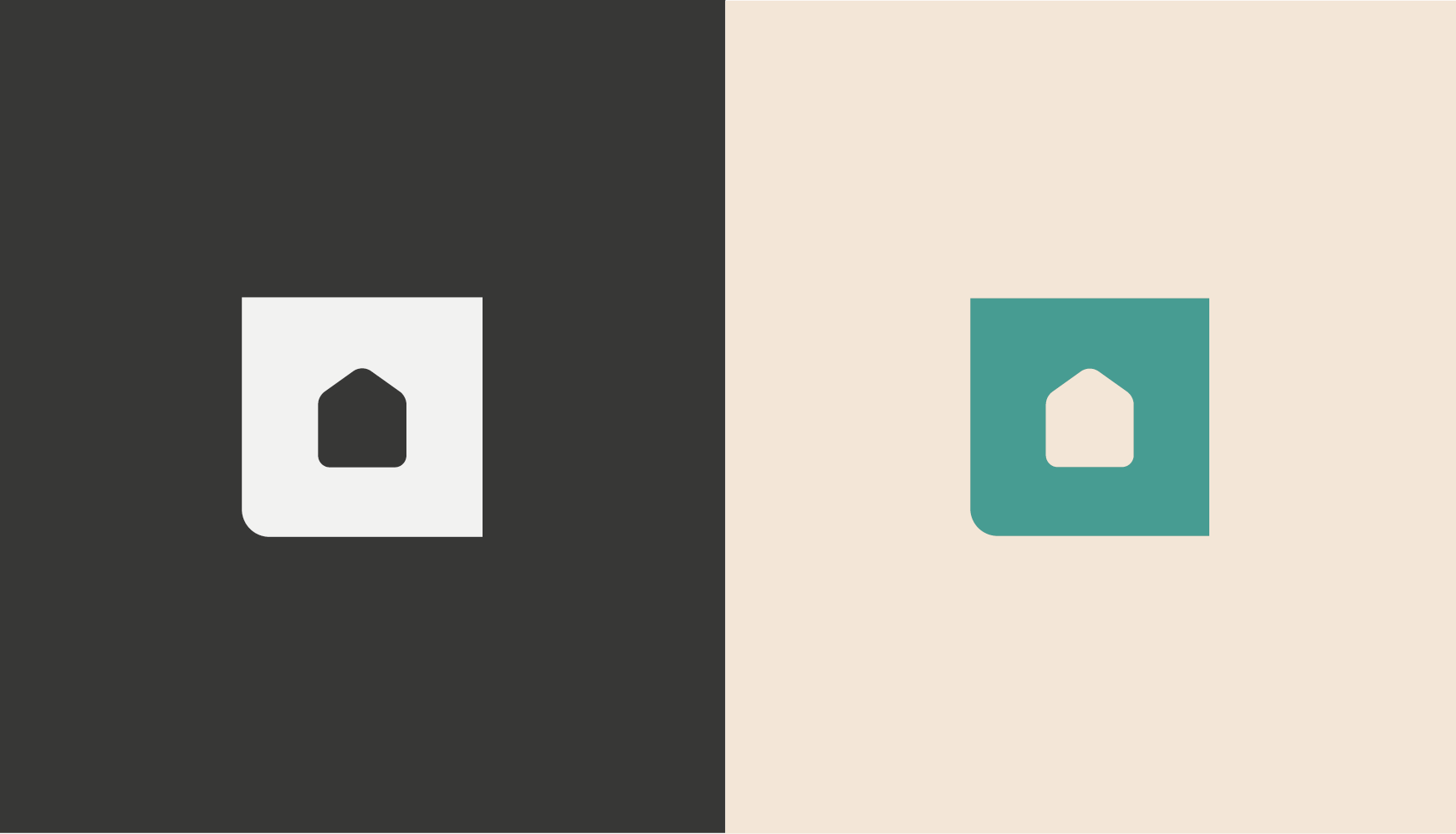
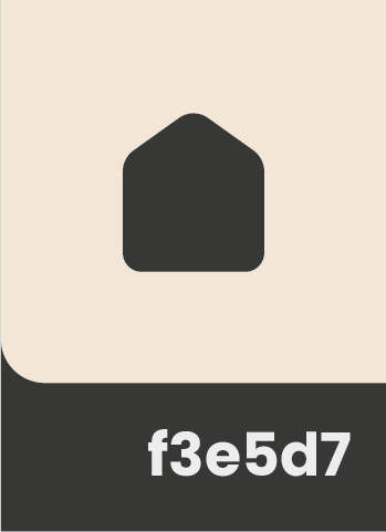
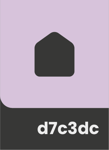
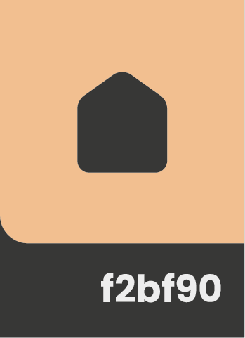
Iconography
The iconography follows the same rules as the home icon (enclosed in a chamfered square) and utilises the primary colour palette. The icons can be used on signage, stationery, etc. and also as a wayfinding tool.